
Paper Prototyping
In Brief
Paper prototyping is a low-fidelity usability test where you draw screens or interface elements on paper and have a real user interact with them as if they were a working product. One person acts as the user while another swaps paper screens in response to each action, simulating the product’s behavior. The output is direct observation of where users get confused, stuck, or surprised — giving you design feedback in minutes without writing any code.
Common Use Case
You have multiple design directions for a key part of your product and you are not sure which one makes sense to users. Before investing in a digital prototype, you want fast, cheap feedback from real people. You put rough paper sketches in front of them and watch where they tap, hesitate, or get confused.
Helps Answer
- What basic shape might our solution take?
- Where do users get stuck or confused in our design?
- Is our product intuitive enough to use without instructions?
- Are there situations or errors we did not think of?
- What information do users need to complete a task?
Description
Paper prototyping is a low-fidelity usability test where hand-drawn screens stand in for a working interface. A real user attempts a real task, tapping or pointing at the paper. A second person — the “computer” — swaps screens or moves cutouts in response to each action, simulating how the product would behave. A facilitator coaches the user to think aloud; one or more observers take notes. The technique is documented end-to-end by Carolyn Snyder in Paper Prototyping — Carolyn Snyder, Morgan Kaufmann 2003, which traces the method back to Wizard-of-Oz studies in human–computer interaction.
Use paper prototyping when the questions you have are about flow and structure: does the user understand what to do next, do they look in the right place for a function, do they recognize the labels you chose. The empirical case for using paper at all comes from Marc Rettig’s Prototyping for Tiny Fingers — Marc Rettig, CACM 1994, which argued — and was later widely confirmed — that low-fidelity paper sessions surface substantially the same usability defects as code-based prototypes, at a fraction of the cost. Paper is the wrong tool when the question is about visual placement, scroll behavior, animation, micro-interactions, or anything keyboard- and pointer-specific. For those, you need a clickable prototype or the real thing. Bill Buxton’s Sketching User Experiences — Bill Buxton, Morgan Kaufmann 2007 makes the same point from the design side: a sketch is meant to invite change, a finished mockup is meant to defend a decision, and confusing the two costs you the feedback you came for.
AI wireframe tools — v0, Figma AI, Galileo and similar — can collapse the prep cost of a “paper” prototype to a few minutes. The trade-off is that their default output looks polished enough to push testers into design feedback (color, typography, layout opinion) instead of flow feedback (where they got stuck, what they expected to happen). If you go that route, deliberately strip the fidelity back: turn off color, replace real copy with placeholder text, and tell the participant up front that the visual treatment is not the subject of the test.
How to
Prep
- Define the task. Write the user task you are testing in one sentence — for example, “A first-time user signs up and creates their first project.” If you cannot state it in one sentence, you are testing too many things at once.
- Sketch the happy path, then the branches. Draw the screens a user sees when they complete the task without trouble. Then add screens for the most likely error or branch states (validation failure, empty state, “not found”). Keep the fidelity deliberately rough; per Buxton, polished sketches invite the wrong kind of feedback.
- Recruit five testers who match your real user. Snyder’s working number is five participants per round — beyond that, new defects arrive slowly. The catch is selection bias: five people who already understand your domain will not surface the issues a real beginner would. Recruit against the actual target user, not your network.
- Assign roles before the session. Decide in advance who plays the “computer” (swaps screens, never speaks), who facilitates (prompts the user to think aloud, stays neutral on the design), and who observes (takes notes, watches body language). Mixing these roles mid-session is how facilitators accidentally lead the user.
- Pilot once internally. Run the full script on a teammate who has not seen the screens. You are looking for missing screens, ambiguous prompts, and any place the “computer” has to improvise — those are the screens you forgot to draw.
- Decide how you will capture data. Pick one of: a written defect log per session, a photo of every screen state the user reached, or a recorded screen of a tappable digital version. You only need one — pick before you start.
Execution
- For each screen or interface state in the task, lay out the paper mockup illustrating what the user would see. For quick internal ideation, paper is faster than any digital tool — you can sketch, rearrange, and discard in real time with no overhead. For external sessions (especially remote ones), an AI-generated low-fidelity wireframe from a tool like v0 or Figma AI is easier to share and modify between sessions. In either case, keep fidelity deliberately rough: if participants start commenting on visual polish rather than flow and structure, the prototype is over-engineered.
- One person (or a pair) plays the customer.
- Another person (or several) plays the “computer” — the software simulator.
- The customer interacts with the paper prototype as if it were a real application, physically tapping or pointing at the interface. Encourage them to explain their thinking aloud as much as possible.
- For each action the customer takes, the computer moves or swaps the paper to reflect the new state. As a general rule, the computer does not talk. Per Snyder, breaking that rule is the most common way a paper-prototype session collapses into a tutorial.
- For more formal sessions, observers watch for additional insights and capture notes. A facilitator may also be useful, prompting the customer to ask questions and think aloud without coaching them through the flow.
- If a layout or interaction clearly is not working, mock up an alternate flow on the spot and re-run the same task. Paper is cheap; that’s the point.
Analysis
You are looking for places where the customer got stuck, could not find what they were looking for, or accidentally went down the wrong path. Anything misleading, confusing, or hard to find is noteworthy. For each, dig into what information the customer was missing that led to the confusion and how that information could be provided — or how the need for it could be eliminated. Watch for situations where the response by the “computer” was not defined, or where an action was possible that you did not want to be possible. Also revisit assumptions about the customer’s motivations and the knowledge or experience base they bring; the test will often expose assumptions that did not hold and suggest ways to improve the solution.
Cluster the friction observations across all five sessions before deciding what to change. A single confused tester might be noise; the same hesitation in three out of five is a defect. Rettig’s original argument was specifically that low-fidelity sessions catch substantially the same defects as high-fidelity ones — so trust what you saw, and do not wait for a polished prototype to “really” test it.
- Confirmation bias A facilitator or other participant who knows the software too well can drop “hints” that lead the customer through the flow. Brief facilitators to stay neutral, read prompts as written, and respond to questions with “What would you expect?” rather than an answer.
- Social desirability bias Customers may hide feedback when they are worried about appearing incompetent or offending the team. Reassure them up front that you are testing the design, not the user, and that confusion is data you need.
- Selection bias If the test user is more experienced than the real audience, you will miss issues a less savvy user would have surfaced. Recruit testers who match the actual target user, not whoever is convenient.
- Fidelity drift Paper prototypes can miss fine-grained usability issues like placement, pixel-level alignment, scroll behavior, animation, and keyboard or pointer interactions. Move to a clickable prototype or a coded build for that level of detail.
- Over-polished AI prototypes AI wireframe tools can produce outputs that look finished enough to distract testers into giving visual feedback rather than flow feedback. If using an AI-generated prototype, deliberately reduce its fidelity (strip color, use placeholder text, remove brand marks) before testing.
Learn more
Case Studies
PalmPilot
Jeff Hawkins is widely credited with carving a wooden block to the intended device size, using a whittled chopstick as a stylus, and slipping paper “screens” into a sleeve to simulate the interface. He carried it for weeks, pretending to take notes and check appointments in meetings to feel out which interactions were essential. The exercise validated the four core features that shipped on the original PalmPilot in 1996. The Computer History Museum dates the wooden model to the mid-1990s in its mobile-computing exhibit. and The Palm Pilot Story — Alberto Savoia, Medium 2019
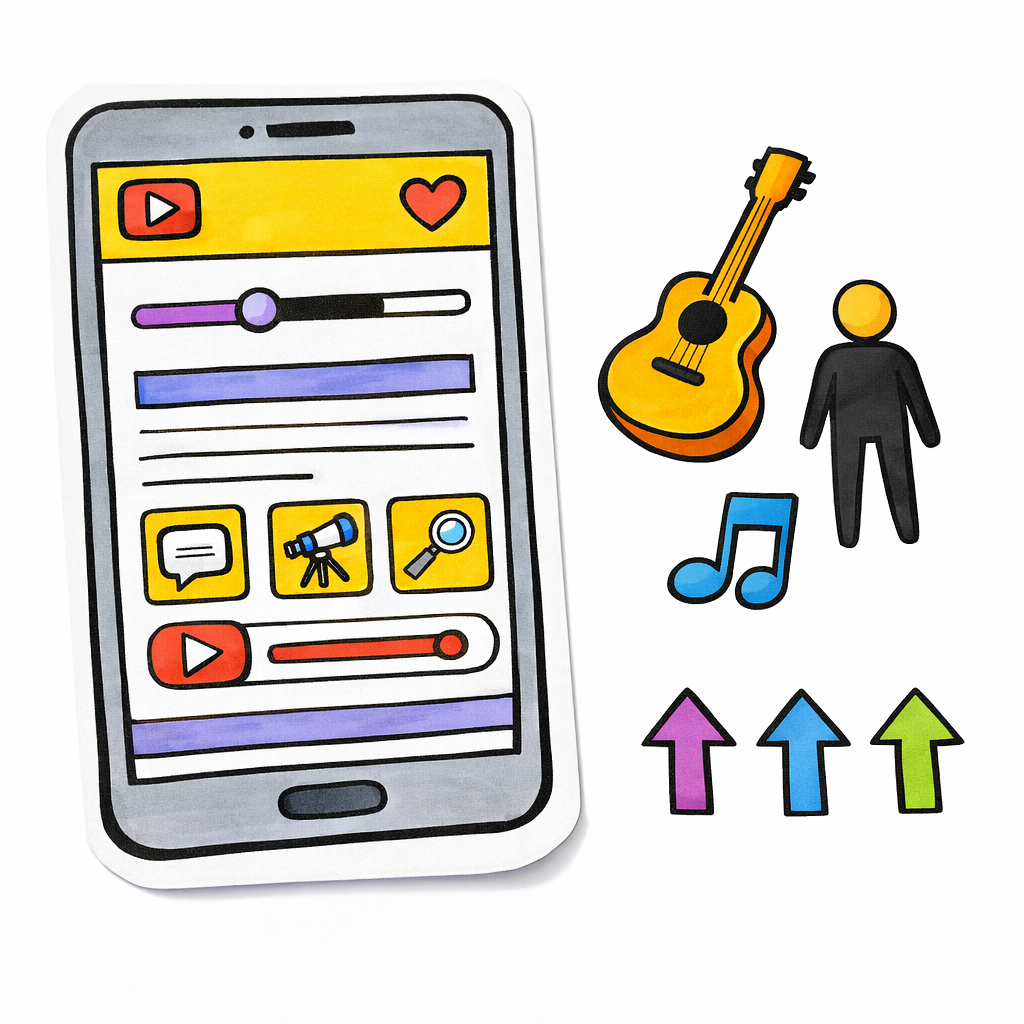
TenTune
A small music-product team used paper sketches and pencil iteration to settle the core interaction model for their app before any code was written. Iterating on paper let them throw out two early designs that tested poorly without burning engineering time on either.
Lean Tools: How TenTune Harnessed the Power of the Pencil — Grasshopper Herder
IBM
Among the first large companies to adopt paper prototyping as standard practice in the mid-1990s, pioneering the method at enterprise scale. Snyder’s later book documents IBM-team work showing that paper prototypes uncover substantially the same usability problems as high-fidelity digital prototypes.
Further reading
- Paper Prototyping — Carolyn Snyder, Morgan Kaufmann 2003
- Prototyping for Tiny Fingers — Marc Rettig, CACM 1994
- Sketching User Experiences — Bill Buxton, Morgan Kaufmann 2007
- The Design of Everyday Things — Don Norman, MIT Press 2013 rev. ed.
- PalmPilot wooden model — Computer History Museum
- NN/g: Paper Prototyping
Got something to add? Share with the community.