
Value Proposition Test - Extended Landing Page
In Brief
An extended landing page smoke test is a multi-section landing page that goes beyond a simple Landing Page Test by adding feature sections, pricing tiers, FAQ content, social proof elements, and a multi-step conversion funnel. Where a simple landing page answers “is anyone interested?”, an extended landing page answers “how interested are they, what features matter, and what will they pay?”
The richer page structure generates richer data. Instead of a single conversion rate, you get scroll depth, section-level engagement, pricing tier clicks, FAQ interactions, and funnel drop-off points — each revealing a different dimension of demand and preference.
Common Use Case
You already validated top-of-funnel interest with a simple landing page or another smoke test, and now you need to dig into which specific features and price points carry the demand. You have to decide what to build first, what to charge, and how to position — and the cheap signal of “did anyone sign up?” is no longer enough. You want section-level engagement, pricing-tier preference, and funnel drop-off data before you commit to a build plan.
Helps Answer
- Which features or benefits generate the most interest?
- Is the pricing acceptable, and which tier is most attractive?
- How deep is visitor interest — do they read the whole page or bounce early?
- Where in the conversion funnel do visitors drop off?
Description
Extended landing page smoke tests are part of the Value Proposition Test family — methods that test demand for a promise by asking participants to commit money, time, data, or actions. The extended page tests scroll-depth engagement and pricing-tier preference, not just the top-of-funnel signal.
A simple landing page tests the headline: does the core value proposition attract interest? An extended landing page tests the full story: features, pricing, objections, and depth of commitment.
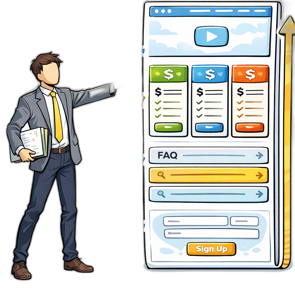
The extended page typically includes:
- Hero section: Headline and primary value proposition (same as a simple landing page)
- Feature or benefit sections: 3-5 detailed descriptions of what the product does, each testable for engagement
- Pricing tiers: 2-3 options at different price points, testing willingness to pay and preferred feature bundles
- FAQ section: Addresses common objections, with each question’s click rate revealing what concerns visitors most
- Social proof: Testimonials, logos, or usage statistics (use real data from interviews or early users if available)
- Multi-step CTA: Instead of a single email capture, guide visitors through 2-3 steps (select a plan, enter details, confirm) to measure commitment depth
The key advantage over a simple landing page is the granularity of data. You’re not just measuring “interested or not” — you’re measuring “interested in what, at what price, with what concerns.”
How to
Prep
1. Start with a validated simple landing page.
Don’t build an extended page from scratch. Run a simple landing page test first. If the basic value proposition doesn’t convert, adding more detail won’t fix it. The extended page is for deepening your understanding of demand that already exists.
2. Define what you want to learn from each section.
Every section should test a specific question:
- Feature sections: Which capabilities matter most?
- Pricing tiers: What will people pay, and which bundle is most attractive?
- FAQ: What are the biggest objections or concerns?
- Social proof: Does credibility increase conversion?
Execution
1. Design the page with clear section boundaries.
Use distinct visual sections so analytics tools can track scroll depth and engagement per section. Each section should be independently valuable — visitors who only read the top half should still get enough information to act.
2. Set up pricing tiers that test real questions.
Use 2-3 tiers with meaningful differences. The distribution of clicks across tiers tells you about price sensitivity and feature prioritization. Include a “most popular” tag on the middle tier to test anchoring effects.
3. Implement section-level tracking.
Go beyond basic page analytics. Track:
- Scroll depth (what percentage of visitors reach each section)
- Time spent per section
- Click events on pricing tiers, FAQ questions, and feature CTAs
- Funnel drop-off at each step of the multi-step CTA
Tools like PostHog, Hotjar, or Microsoft Clarity provide heatmaps and session recordings that show exactly how visitors interact with each section.
4. Drive targeted traffic.
Use the same traffic sources as a simple landing page test but expect to need more visitors — you’re analyzing sub-segments of behavior, which requires larger sample sizes. Plan for 500+ unique visitors minimum.
5. Set success thresholds per section.
Don’t just set an overall conversion target. Define what success looks like for each section: “At least 60% of visitors scroll past the feature section,” “The middle pricing tier gets 50%+ of pricing clicks,” “FAQ bounce rate is below 30%.”
6. Run for 2-4 weeks.
Extended pages need more time than simple pages because you’re collecting more granular data. Resist the urge to change sections mid-test.
Analysis
1. Compare each section’s performance against the thresholds you wrote down before launch.
The thresholds (scroll depth, time per section, pricing-tier distribution, funnel drop-off) tell you which sections are pulling weight and which are dead. Without them, every section’s data feels marginal and no decision gets made.
2. Read the result patterns:
- High scroll depth, high conversion: The full story is compelling. Visitors are engaged throughout and convert at the end. Strong signal to proceed.
- High scroll depth, low conversion: Visitors are interested enough to read everything but not enough to act. The problem may be pricing, the CTA, or a missing piece of the value proposition. Check which pricing tier got the most attention and what FAQ questions were clicked most.
- Low scroll depth, low conversion: Visitors disengage early. The problem is likely the hero section or the transition to the first feature section. Revisit the headline and opening message.
3. Read the pricing-tier signal.
If most clicks go to the cheapest tier, your higher tiers may be overpriced or under-differentiated. If clicks are evenly split, your tiers are well-calibrated. If the middle tier dominates, the anchoring is working — but verify with a follow-on pre-sales test before locking that price.
4. Cluster the FAQ engagement.
The most-clicked FAQ questions reveal the biggest objections. Address these more prominently in your next iteration — moved into the hero copy, the pricing area, or the section that introduces the relevant feature.
5. Read the funnel drop-off.
Where visitors abandon a multi-step CTA tells you where commitment breaks down. Drop-off at “select a plan” suggests pricing concerns. Drop-off at “enter details” suggests trust concerns. Drop-off at “confirm” usually means the offer is fine but the friction is too high.
6. Segment the data.
A 5% overall conversion rate may hide a 12% rate from one traffic source and a 1% rate from another. Cross-tabulate by traffic source, device, and (if you have it) any demographic data — the difference between segments is often where the real signal lives.
- Length bias Longer pages have lower overall conversion rates simply because there’s more to read and more places to leave. Compare against extended page benchmarks, not simple page benchmarks.
- Section order effects Visitors engage most with the first sections they see. Sections at the bottom get less attention regardless of content quality. Consider A/B testing section order.
- Pricing anchoring The way you present pricing tiers influences which one visitors choose. A “decoy” tier can make the target tier look more attractive. This tests your pricing design skills, not pure demand.
- Analysis paralysis More data doesn’t always mean better decisions. Identify 2-3 key metrics before launch and focus on those. Don’t get lost in heatmap patterns.
- Over-optimization trap It’s tempting to iterate endlessly on section-level metrics. Set a clear decision point: after one round of testing, decide whether to proceed, pivot, or abandon.
Learn more
Case Studies
Buffer
Buffer’s earliest extended landing page added a pricing-tier section before a single feature was built; the click distribution across plans (free, paid, business) gave the founders the data to commit to a paid model and an order in which to ship features. The page evolved into the validated entry point that drove their initial 100-customer cohort.
Dropbox
Dropbox’s pre-launch page combined a hero, a feature-walkthrough video, an explicit feature list, and an email capture; the resulting waitlist grew from 5,000 to 75,000 signups overnight. The extended-format page tested both top-of-funnel demand and which specific capabilities (sync, sharing, mobile) people actually cared about before any code shipped.
Got something to add? Share with the community.