
Storyboard the Pain
In Brief
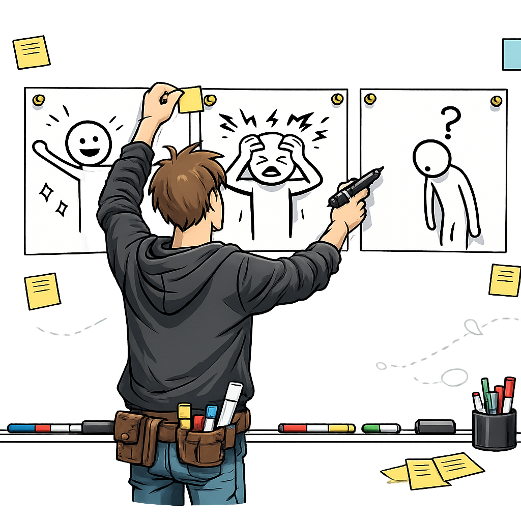
Storyboard the Pain is a visual storytelling technique where you create a 4-8 panel comic-strip narrative that depicts the current customer experience and the pain point they face. You then walk potential customers through the storyboard and observe where they correct, hesitate, or expand on the panels. The goal is generative — you are looking for qualitative feedback about whether you understand the problem correctly, not asking for a yes/no validation of your solution.
For the solution-focused counterpart, see Storyboard the Solution.
Common Use Case
You have spoken with a handful of customers and you believe you understand their pain point, but the problem statement you have written down still feels abstract. Before you commit engineering effort to a solution, you want to pressure-test whether you have the customer’s experience right — the sequence of steps, the trigger, the emotional beat at the moment things go wrong. You sketch the narrative as a low-fidelity comic and walk customers through it so you can watch them correct, hesitate, or expand on each panel.
Helps Answer
- Am I describing the customer’s problem accurately?
- Do I understand the context in which the pain occurs?
- What parts of the customer experience am I getting wrong or missing?
- Is the emotional weight of the problem as significant as I assume?
- What happens before and after the painful moment?
- Are there steps in the experience I have not considered?
Description
A pain storyboard is a visual narrative that walks through a customer’s current experience, ending with (or centered on) the pain point you believe exists. Unlike a written description, a visual storyboard is concrete and specific — it forces you to commit to details about who the customer is, what they are doing, where they are, and what goes wrong. This specificity makes it much easier for customers to react to and correct.
This is how seasoned UX and service-design teams already work. Storyboarding a pain narrative, walking customers through the panels, and observing where they correct, hesitate, or expand on each frame is a standard part of the discovery toolkit alongside customer interviews and contextual inquiry. The method is generative because customer reactions to the storyboard reveal new information. They may say “that is exactly right” about some panels and “that is not how it works at all” about others. They may describe additional steps, different emotional reactions, or entirely different contexts. This feedback reshapes your understanding of the problem space.
Storyboards are especially powerful because they are low-fidelity and obviously incomplete. Customers feel comfortable critiquing a rough sketch in a way they often do not feel comfortable critiquing a polished presentation. The visual format also transcends language barriers and works across literacy levels, which is part of why service designers reach for storyboards when the journey crosses channels, departments, or cultural contexts.
How to
Prep
-
Define the pain point you want to depict. Write a one-sentence description of the problem you believe your customer faces. Be specific about who the customer is, what they are trying to accomplish, and what goes wrong. Vague pain statements produce vague storyboards.
-
Sketch the first and last panels first. The first panel establishes the context (who, where, what they are trying to do). The last panel shows the consequence of the pain (frustration, wasted time, lost money, embarrassment). Starting with these two endpoints anchors the narrative.
-
Fill in the middle panels. Add 2-6 panels that show the steps between the starting context and the painful outcome. Each panel should depict one moment or action. Use simple visuals — stick figures, basic shapes, arrows — and minimal text. Captions or speech bubbles can clarify what is happening, but the visuals should carry the primary narrative.
-
Prioritize visuals over text. Resist the urge to write paragraphs of explanation. If a panel needs more than one sentence of caption, you are trying to convey too much in a single frame. Split it into two panels instead. The storyboard should be understandable at a glance.
-
Recruit 3-5 target customers. Storyboard reviews produce useful patterns when you can compare reactions across multiple sessions. Aim for 3-5 customers from your target segment for the first round, then iterate the panels and run a second round if reactions are mixed.
-
Prepare the session script. Decide how you will introduce the storyboard, what open-ended questions you will ask, and how you will record corrections, hesitations, and additions. Pilot the script with one customer or a colleague before running it for real.
Execution
-
Walk the customer through the storyboard panel by panel. Present the storyboard and narrate each panel briefly. Do not rush — give the customer time to absorb each frame before moving on. Avoid defending or explaining the visuals beyond a single sentence per panel.
-
Ask open-ended questions. Use prompts like “Does this look like your experience?” “What would you change?” “What am I missing?” “How does this make you feel?” Avoid yes/no questions. The goal is to invite correction, not seek agreement.
-
Observe corrections, hesitations, and expansions. Note which panels customers confirm without comment, which they correct, where they pause, and where they add detail. Hesitations are often as informative as explicit corrections — a customer who frowns at a panel but does not articulate why is signaling something is off.
-
Capture emotional reactions. Pay special attention to moments where customers say “yes, that is exactly it” or “no, that is not right at all,” or where their tone or expression shifts. These are the most informative data points.
-
Resist the urge to defend. When a customer corrects a panel, your instinct will be to explain why you drew it that way. Do not. Acknowledge the correction, take notes, and ask follow-up questions. The storyboard is a probe, not a position to defend.
Analysis
-
Aggregate corrections across customers. After each session, log which panels were confirmed, corrected, and expanded, plus key quotes. After 3-5 sessions, compile the pattern. Panels that multiple customers correct in the same direction are clearly wrong; panels that different customers correct in different directions may signal multiple personas.
-
Pay more attention to emotional reactions than rational critiques. A customer who gets visibly frustrated looking at a panel is confirming that the pain is real and significant. A customer who shrugs and says “I guess that is sort of right” may be signaling that the pain is not urgent enough to build a business around.
-
Catalog the additions. Steps customers add independently — especially when multiple customers add the same missing step — are likely important to the experience and may contain additional pain points worth investigating.
-
Watch for segmentation signals. When different customers react to the same panel in opposite directions (“this is exactly my experience” versus “this is nothing like my experience”), you may be looking at distinct personas with different journeys, not one customer with a single pain point.
-
Treat “I guess that is sort of right” as a red flag. Lukewarm validation is often an honest signal that the pain is not significant. Probe whether the customer has a stronger reaction to a different panel or a different version of the story before concluding the pain is real.
-
Note what customers ignore. Panels that customers skim past without comment may be either obviously correct or completely irrelevant to them. Probe both possibilities — silence is data, but it is ambiguous data.
- Leading narrative bias The storyboard itself frames the conversation. Customers may agree with your narrative because it seems reasonable, even if it does not match their actual experience. Use open-ended follow-up questions to counter this.
- Social desirability bias Customers may not want to criticize your work, especially if you are visibly the creator. Have someone else present the storyboard if possible, or explicitly invite criticism.
- Anchoring bias The specific details you include in the storyboard anchor the conversation. Customers may correct details within your frame rather than offering an entirely different frame. Ask “what am I not showing here?” to counter this.
- Recall bias Customers may not accurately remember their own experience when comparing it to a storyboard. Where possible, conduct the review close to when they last experienced the pain.
- Creator attachment You may unconsciously resist feedback that contradicts your storyboard, especially after investing time in creating it. Remember that discovering you are wrong is the most valuable outcome.
Learn more
Case Studies
IDEO shopping cart redesign (Nightline, 1999)
In the well-documented ABC Nightline segment “The Deep Dive,” IDEO designers used storyboarding alongside observation and journaling to map shopper pain points before redesigning the supermarket shopping cart. The team sketched everyday shopping scenarios — child seating, navigation in crowded aisles, theft, checkout friction — to ground the redesign in observed customer experience rather than founder assumption. The episode is one of the most widely cited examples of design-led discovery and shows storyboarding used as a standard step in mapping pain before generating solutions.
Nielsen Norman Group — Storyboards in UX research practice
NN/g’s published guidance documents how UX teams use storyboards to communicate user pain points to stakeholders and to surface gaps in the team’s understanding of the customer journey. The article walks through how a multi-panel storyboard makes a user’s problem concrete enough that stakeholders and customers can argue with it, which is the same review mechanic this method relies on.
Further reading
- Storyboards Help Visualize UX Ideas — Nielsen Norman Group
- Journey Mapping 101 — Nielsen Norman Group
- This Is Service Design Doing — Marc Stickdorn et al. (Service Design Network)
- Storyboarding in the Software Design Process — UX Magazine
- About Face: The Essentials of Interaction Design — Alan Cooper et al. (Wiley)
Got something to add? Share with the community.