Business Model Canvas Redesigned for UX: A Customer-First Approach
Because starting with Key Partners instead of customers is just weird.
 By Tristan Kromer ·
 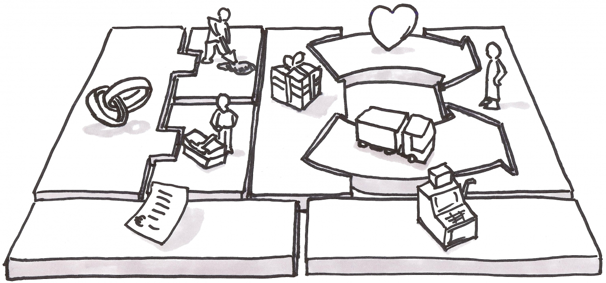 Alexander Osterwalder’s Business Model Canvas is the tool of choice for a quick, one page dashboard of your business hypotheses. It very much appeals to the business guy in me, but it irks the User Experience (UX) part of my brain. But hey…the canvas is a tool. Use the right tool for the right job. I’m not suggesting the canvas is wrong. It is neither right nor wrong. It’s a paradigm through which you can view your business model. There are many such paradigms available for your to choose. Ash Maurya has his own “lean” canvas, there’s the Balanced Scorecard approach, Getting to Plan B dashboards, etc. These are all just tools. Use the one that helps you. tl;dr This is a fairly detailed follow up of why I’ve modified the BMC for UX focus. You can always skip to the end and I’ve posted a “how to use the business model canvas” example. And here’s the download link: Download
Quick Answer: The standard Business Model Canvas follows supply-chain chronology, starting with Key Partners on the left — but as product and UX practitioners, we should start with the customer. By flipping the canvas so Customers appear on the left, reversing the Customer Relationships arrow to create a Build-Measure-Learn feedback loop, merging Key Partners into Key Resources, and combining Costs/Revenue into one visual row, we get a canvas that prioritizes user-centered thinking over business logistics. You can download the modified UX-focused template for free.
Form Should Fit Function
The first time I saw the canvas I just could not figure out why it was shaped the way it was no matter how hard I looked. Brant Cooper finally had to explain it to me. Production is on the left, customer is on the right, product meets in the middle. Costs are mostly associated with production, so those go under production. Revenue comes from the customer so that’s under the customer. Makes sense, but even after looking at it for years and through it’s evolution I still have questions:
- Aren’t distribution channels and customer relationships/support COSTS? Shouldn’t costs be under them as well?
- Like most English readers I read left to right, so I start looking at the canvas, so why should I start thinking about my business model by focusing on Partners instead of the Customer?
- Why is Key Partners so damn big?
- Why can’t I fit my customer persona (which is an 8.5”x11” piece of paper horizontal) onto the customer block?
RTFM
Of course these questions are a bit unfair and nit picky. Osterwalder does a great job of explaining things step by step in his book Business Model Generation and sure enough…he starts with the Customer, not Key Partners. But I hate reading the f***ing manual and Steve Krug says “Don’t Make Me Think”. So I’m going to tweak this for my own purposes.
Customer Comes First
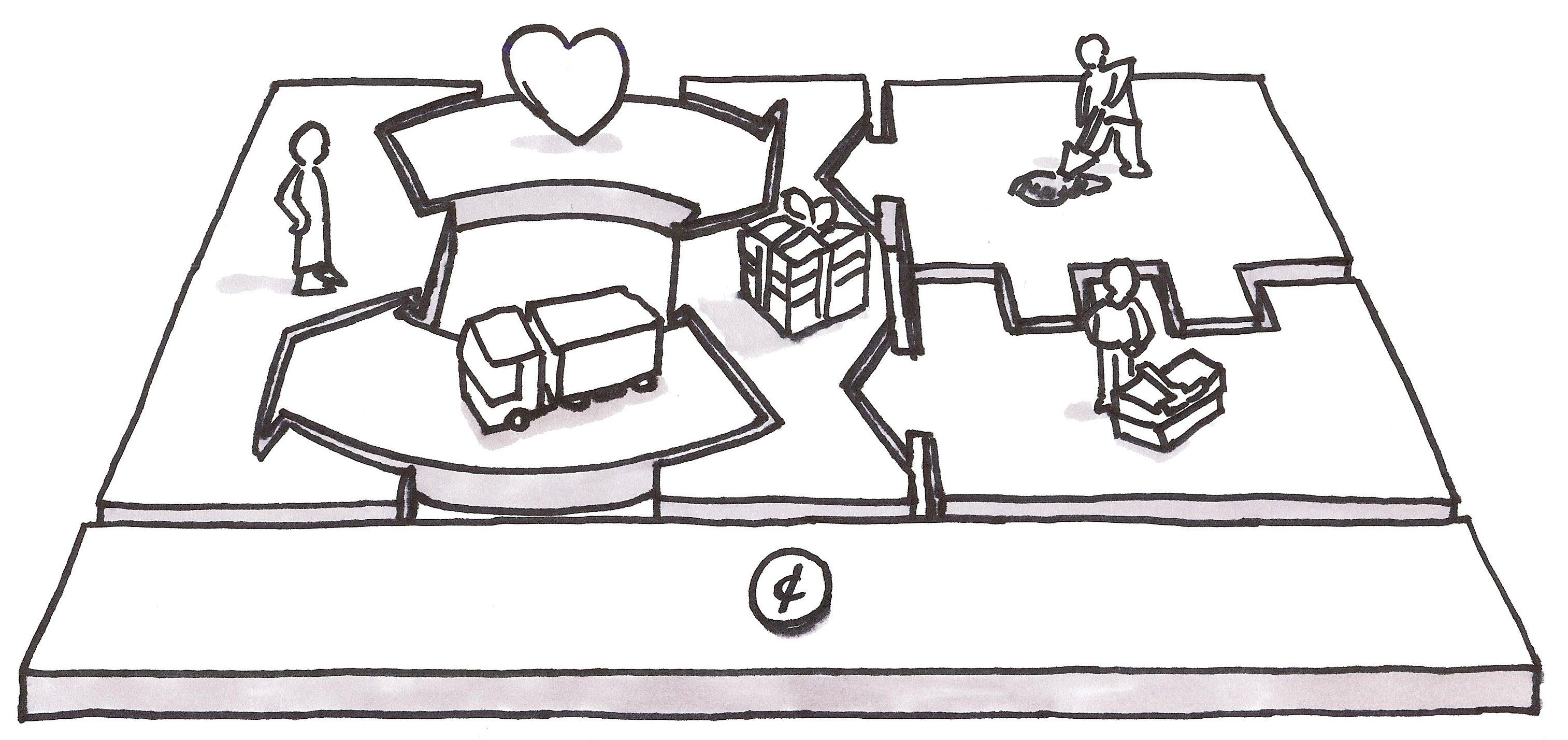
First nitpick, the customer should be the focus of the canvas. You’re reading this sentence left to right, the canvas is the same. The Business Model Canvas is organized chronologically because it’s made by business people, for business people, and it’s based on a supply chain. You negotiate with your your suppliers (a.k.a Key Partners) to purchase raw materials (a.k.a. Key Resources) and then transform them via your manufacturing process (a.k.a Key Activities) into a product (a.k.a Value Proposition) which is then delivered via Channels to the Customers. …but I don’t really came about chronology here. I’m trying to think out what I need to produce my Value Proposition. So I want to start left to right. This is an easy change, but this will irritate those of you very comfortable with the current BMC: 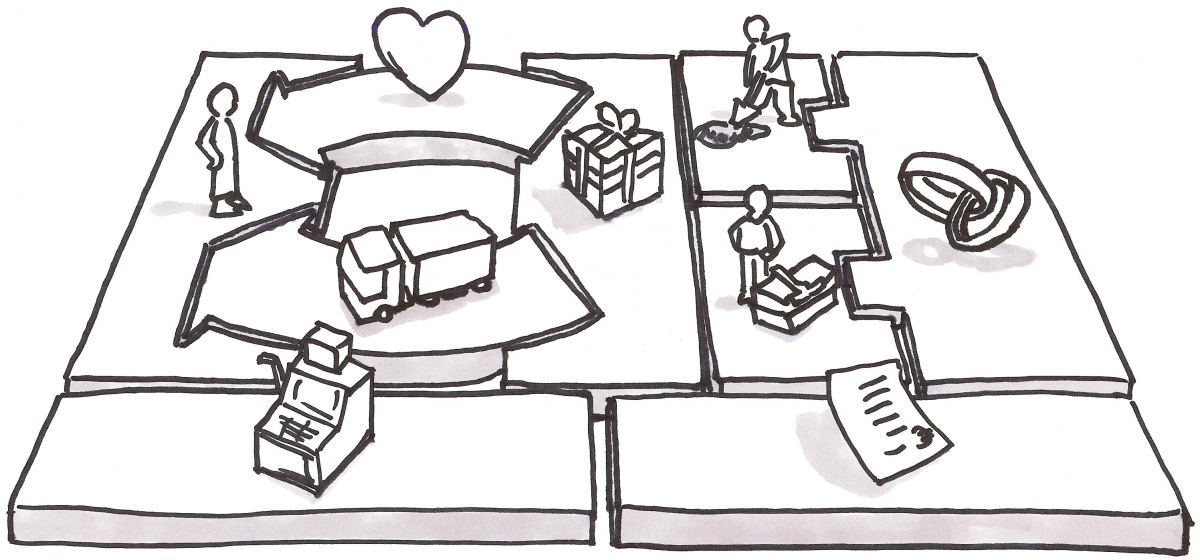 Simple fix. Now when filling this out I’m going to start (as Osterwalder does) with Customer (“Who am I trying to help?”) and work my way towards the Value Proposition (“What does the customer want?”) Only then will I figure out how to produce that value. Now let’s zoom in on the top left quadrant…
Product / Market Fit
 Here we have the Value Proposition (product) delivered via Channels to the Customers. Strangely, we also have Customer Relationships being delivered by a similar arrow to the Customer. This makes sense if you consider Customer Support as a value you deliver to the Customer. That’s fair. …but In the early stages of product development, Steve Blank tells us to get out of the building and talk to customers. Eric Ries also emphasizes the Build-Measure-Learn loop as a means of getting feedback from real user behavior and improving on our Value Proposition. So where’s the Build Measure Learn loop in this picture? There isn’t one.
The Customer Relationship is Backwards
As suggested by Osterwalder, it’s true that your customer relationship might be community based and very hands off like Google. (I dare you to try and get a Googler on the phone to help you with you gmail account.) So the Canvas supports that view of the world. (Note: Ash Maurya’s version of the canvas considers Customer Relationship / Support so unimportant and/or obvious that it doesn’t even get a box anymore. It’s been replaced with Unfair Advantage.) But from my perspective, So I want to make sure that my business model constantly emphasizes getting feedback from the Customer to my Value Proposition. So let’s flip that arrow. 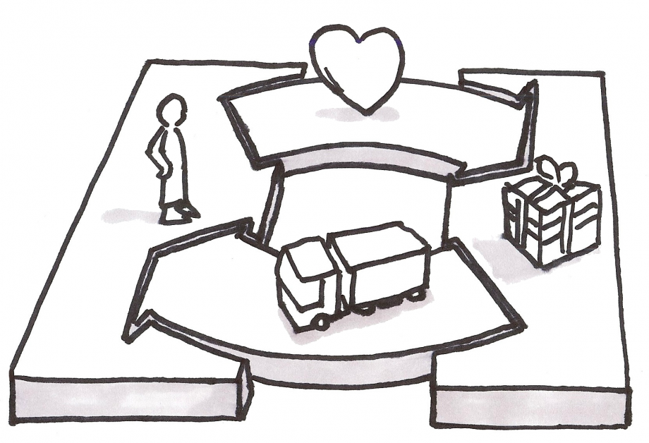 Now whenever I look at my canvas and think about Customer Relationships I’m going to be thinking about it as a feedback loop to the Value Proposition. Now let’s look at…
The Supply Chain
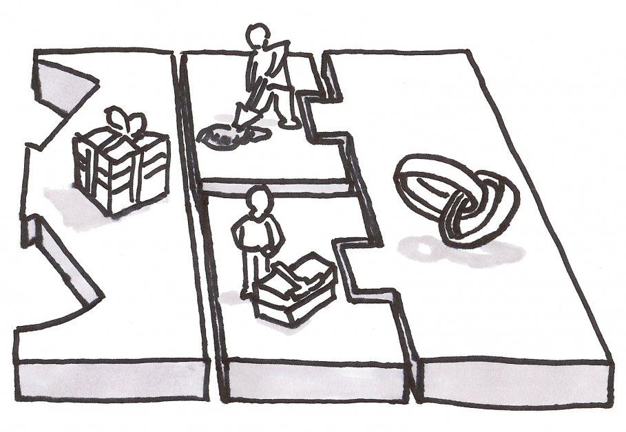 There are a few things here that get in the way of my thinking. First, Key Activities and Key Resources are visually coupled with Key Partners, but not with each other. That’s a bit weird since you need Resources to perform some Activities. Second, the Key Partners is huge box and I never wind up with enough real estate in Key Activities or Key Resources. Finally, why neither Activities nor Resources is visually linked to Value Proposition, I will never understand. (Note: Similar to Customer Relationship, Ash Maurya found the left hand side of the BMC to be the same for every business he was considering, so he replaced it with Problem, Solution, and Key Metrics.) To fill out this side of the canvas and figure out how to produce my Value Proposition, I step through it this way:
- What Key Activities does someone need to perform in order to produce my Value Proposition?
- What Key Resources are required as an input to those Key Activities?
- What Key Partners might perform some of the Key Activities or provide Key Resources instead of my company directly?
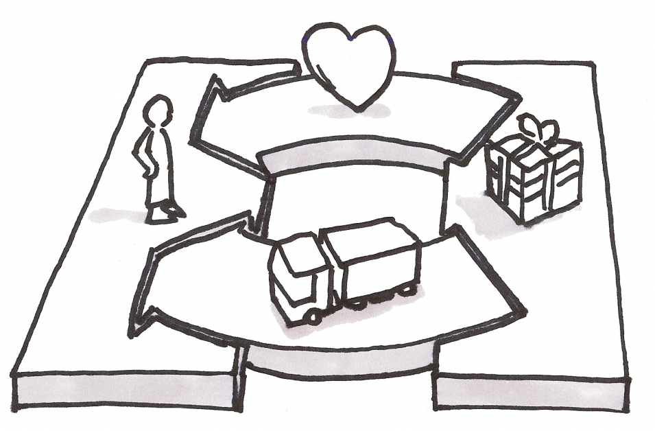
I work backwards from the Value Proposition step by step and construct a very basic production line of Key Activities with yellow sticky notes. Then I can just use another row of sticky notes underneath to note the Key Resources and Key Partners I need underneath that production line. From this perspective, it turns out Key Partners are really just Key Resources. So let’s just remove Key Partners all together and make some new shapes to more strongly stress the production nature of this quadrant. 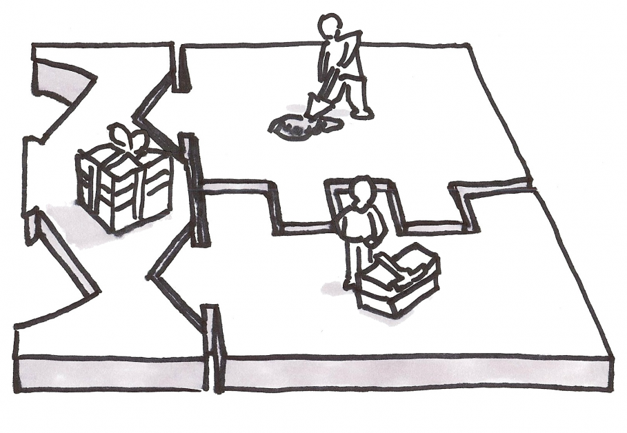 Now I have plenty of space and a visual queue making my eyes goes back to the left towards the Value Proposition and the Customer. But there’s a little more to be done.
Cash Flow
The separation of Cash and Costs makes a lot of sense from a hypothesis perspective. I’m tempted to keep these as two separate boxes. But I am admittedly mentally lazy here. I need a visual queue to associate my Costs with various components of the business model and the biggest Cost that most entrepreneurs forget is the Cost of Customer Acquisition…a.k.a Channels. Costs and Revenues should be directly and visually associated with the aspects of the Business Model that create them. So let’s just finish this off by making one big box for Costs and Revenues. That way I can just drop cost or revenue directly underneath each box that might impact Cost or Revenue. This way I’ll remember to account for costs of Customer Relationships as well as Channels. If I’m lucky, maybe this will even get me thinking about some nice way of adding a Revenue Stream from a Key Partner (now listed under Key Resources) or Key Activity. Now we finally have: 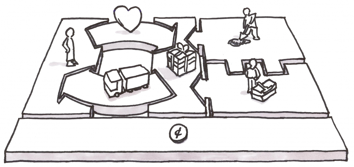 (Note: For those of you terrified of mixing up which sticky note is a Cost and which is a revenue, time to invest in more than one color sticky note. I’d suggest red for Costs and green for Revenue.)
Practical Use
This suits me pretty well, but when I look at it as I’ll use it, in 2D and heavily simplified, there are still some issues. 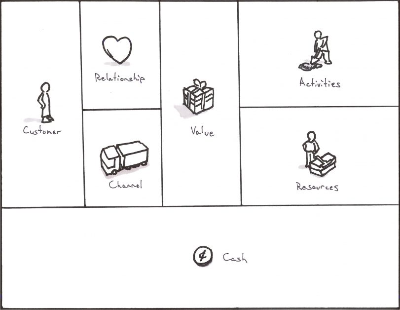 Couple issues here:
- I’ve lost all the nice visual queues I had with interlocking parts
- Customer comes first, but isn’t emphasized
- The Build Measure Learn Loop is no longer implied
So let’s do one final tweak to get something useable and just for good measure, let’s shove in a Think-Make-Check loop (same thing as Build-Measure-Learn) as long as we’re doing this for User Experience peeps.
Start and End with the Customer
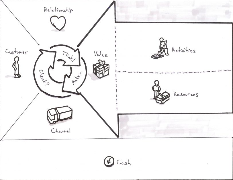 Tada! Now we have a Business Modal Canvas which starts with the Customer. As we fill out the pieces, we’re forced to think about how we are building our Think-Make-Check loop (or Build-Measure-Learn if you prefer) into the Business Model itself. We also have a strong visual queue in the form of a massive arrow drawing our eyes back to the Customer as we think about production. (Hint: There’s a special bonus prize here for 2-sided markets. You can stack these and drop the Cash box to the bottom and you’ll find a nice way to lay out both markets so you can see overlaps in the Activities and Resources.) If you have further suggestions as to how to improve this for User Experience, please send them my way. But in the meantime, feel free to download and save the Business Model Canvas for User Experience template: Download That was admittedly a lot of work for something relatively academic, but it’ll let me explain some (im)practical applications faster in the next few posts where I explain how to create a Business Model Canvas for Renting Puppies.
Frequently Asked Questions
Why is the Business Model Canvas layout confusing from a UX perspective?
The standard Business Model Canvas follows a supply chain chronology — starting with Key Partners on the left and ending with Customers on the right. Since most English readers scan left to right, this means we start thinking about partners instead of customers. The customer segment also gets a relatively small box, making it hard to fit detailed personas. These layout choices serve business logic but work against user-centered thinking.
How do you put the customer first on the Business Model Canvas?
We can simply flip the canvas so the Customer segment appears on the left side instead of the right. This way, when filling it out left to right, we naturally start with “Who am I trying to help?” before moving to the Value Proposition and then production concerns. It’s a simple change that reorients the entire thinking process around the customer.
Where is the Build-Measure-Learn loop in the Business Model Canvas?
The original Business Model Canvas doesn’t include one. The Customer Relationships arrow points from the company toward the customer, implying a one-way delivery of support. By flipping that arrow to point back toward the Value Proposition, we embed a feedback loop directly into the canvas — reminding us that customer relationships should inform and improve what we’re building, not just support what already exists.
What changes were made to the supply chain side of the canvas?
Key Partners was removed as a separate box and folded into Key Resources, since partners essentially provide resources or perform activities on your behalf. Key Activities and Key Resources were visually linked to the Value Proposition with interlocking shapes, and more space was allocated so you can map out a basic production line using sticky notes. This better reflects how we actually think through producing a Value Proposition.
Can I download the modified Business Model Canvas for UX?
Yes. The UX-focused canvas template — which places the customer first, incorporates a Think-Make-Check loop, and merges costs and revenue into a single visual row — is available for free download at kromatic.com/innovation-resources/business-model-canvas-for-ux.
Comments
Loading comments…
Leave a comment