
Lean Startup Prioritization: The Hi-Lo Diagram Fix That Works
Why every sticky note ends up in the same corner — and how to stop it
 By Dan · · 5 min read
 Quick Answer: The key to effective lean startup prioritization with a Hi-Lo diagram is introducing one axis at a time, not both simultaneously. When we present both axes at once, everyone clusters their items in the top-right “high priority” quadrant, making the exercise useless. Instead, place all items along the horizontal axis first (e.g., knowledge level), then add the vertical axis (e.g., business impact) and move items up or down without changing their horizontal position. This five-step sequential approach forces honest relative placement and produces an actually useful distribution.
(This is a guest post by Dan Toma, an Accelerator Manager and Coach, and author of The Corporate Startup Book. You can find Dan on Twitter, LinkedIn or his blog.) Like with so many other good ideas that look trivial on paper, but people struggle applying, lean startup prioritization using a Hi-Lo diagram will be classified, by the ones that tried it and failed, as exactly that: a good idea that even though on paper makes sense, in real life is creating more hustle than it solves. Being a big fan of this way of prioritization ever since I’ve read David Sibbet’s Visual Teams and Visual Meetings, I’ve tried it in many circumstances and actually wrote about it on a couple of occasions. Looking back on all of my attempts of using the method, it is safe to conclude that my success with the method had more to do with the fact that I was using it alone and the number of things I tried to prioritize was quite limited, than with me actually understanding how to build and use a HiLo. 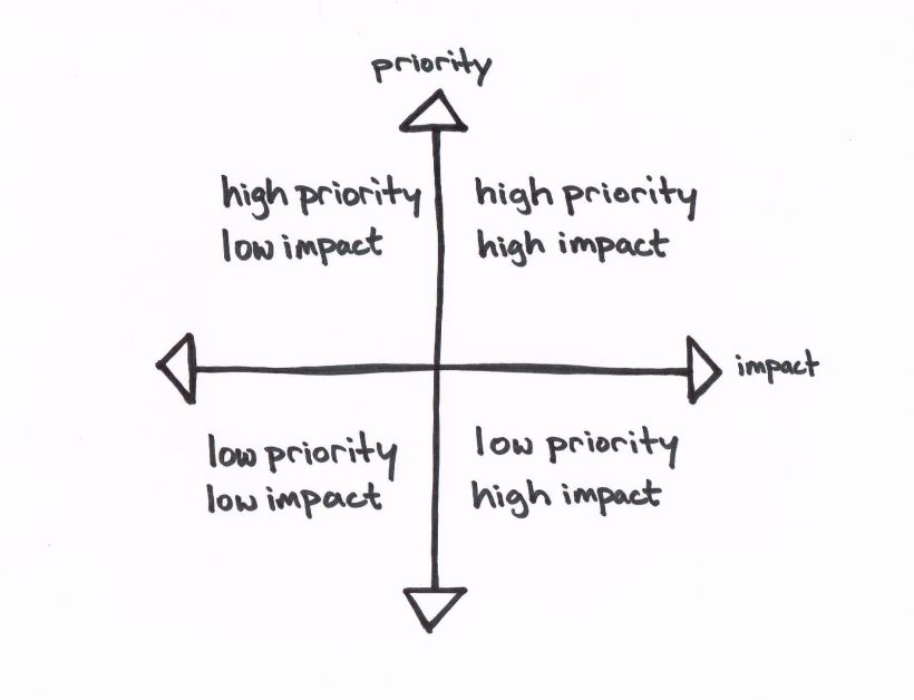 I’ve spent this past summer in Vietnam being involved, as part of a team with Nick and Ryan, in a Train of Trainers program for an Official Development Aid program of the Finnish Ministry of Foreign Affairs. Part of the Train of Trainers Program we, together with our trainees, had to, on a regular basis, prioritize things such as: upcoming ecosystem development events, future government entrepreneurship policies, university curriculum modules, and more. To be able to prioritize such complex topics, in a large group like ours (close to 20 people), we employed the Hi-Lo method, only to realize that we were failing miserably with every attempt and we were creating more arguments than we were solving. The problem was that everyone in the room had a strong opinion and everyone wanted to see their ideas implemented, hence whenever someone was asked to walk to the board where we’ve created the Hi-Lo, their sticky-notes (at least 5 per person) with neatly written ideas ended up in the upper-right corner of the diagram (the higher and righter the better J). As you might imagine our Hi-Lo looked more like a square (the upper-right quadrant) full of sticky-notes than an actual prioritization tool. Honestly, we were better off prioritizing alphabetically than with the Hi-Lo method. At least there wouldn’t have been that much follow-up work. Since it is human nature to consider everything vitally important, some of you might end up experiencing the upper-right quadrant phenomena even when prioritizing alone a handful of items. Clearly this problem is bound to happen with any team larger than 4 members generating more than 2 sticky-notes per person, unless a new way of looking and creating Hi-Los is developed. Talking with Nick and Ryan we realized that the problem was our process of creating and using the Hi-Lo, and not the people being actually honed in with themselves, and the place on the diagram their sticky-notes belong to. Our biggest mistake - and the one I’m sure everyone that tried the method did - was to create 2 axes from the get-go. We realized that by creating only one axis at a time we were going to have a fairly even distribution of items on the final diagram. So here’s a step-by-step process of creating a Hi-Lo that actually works and helps you prioritize items (lean startup prioritization): Step 1: Create and name the OX axis and mark its middle point.
 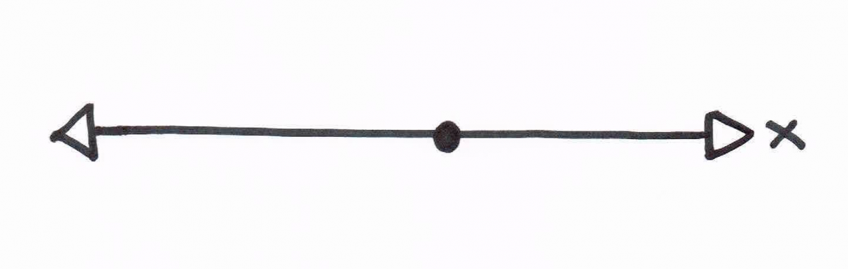 Step 2: Start writing all items on sticky notes.
  Step 3: Start placing the sticky notes on the OX axis.
 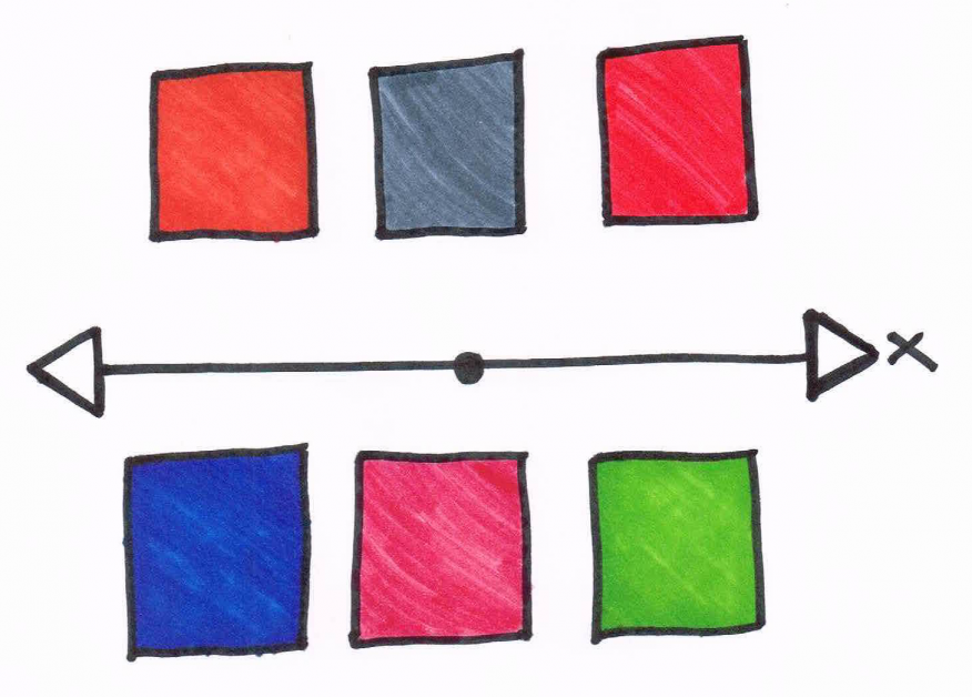 Example: if you try prioritizing assumptions around your business model, you might want to start by naming the OX as ‘knowledge line’. Assumptions that you know more about go on the left side and assumptions that you have less knowledge about go on the right side. Step 4: Create and name the OY axis. Make sure it passes through the middle point of the OX axis. Step 5: Without changing the relative position of the items on the OX axis, start moving them up and down relative to the OY axis.
 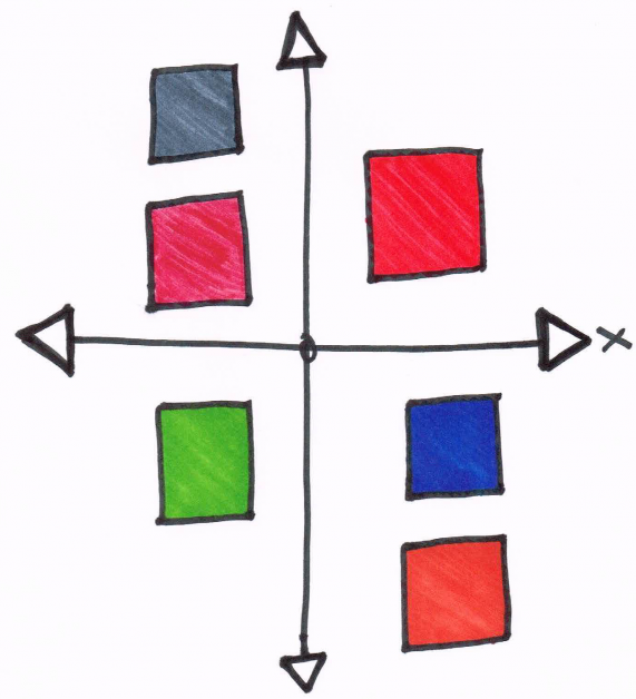 Example: Create the OY axis and name it: impact on business model, with high impact on the upper part of the axis and low impact on the lower part of the axis. Now start vertically moving the assumptions based on their perceived impact on your business model. Remember: you are not to change the relative position of the items on the OX axis. A couple of months after developing this five-step process to creating a HiLo diagram, I had to deliver a workshop on experiment design at Estonia’s largest startup accelerator, Tehnopol. Before I taught the participants how to create relevant experiments that would move their businesses forward, I made them prioritize all their business model assumptions using this five-step process. From what used to be a tedious task, now I have entrepreneurs walking up to me, face smiling, saying that didn’t know prioritization is such a fun and easy thing to do.
Frequently Asked Questions
What is lean startup prioritization using a Hi-Lo diagram?
Lean startup prioritization with a Hi-Lo diagram is a visual method where we plot items on a two-axis matrix to determine what to focus on first. For example, when prioritizing business model assumptions, one axis might represent our level of knowledge and the other the impact on our business model, helping us identify the most critical items to test.
Why do all my sticky notes end up in the top-right corner of a prioritization matrix?
This happens because it’s human nature to consider everything vitally important, especially in group settings where everyone advocates for their own ideas. The root cause isn’t people being unreasonable — it’s the process. When we present both axes at once, participants naturally gravitate toward rating everything as high-priority. The fix is to introduce one axis at a time to force more honest relative placement.
How do you create a Hi-Lo diagram that actually distributes items evenly?
The key is a five-step process: first, create only the horizontal axis and mark its midpoint. Then write all items on sticky notes and place them along that single axis. Next, add the vertical axis through the midpoint. Finally, move items up or down along the vertical axis without changing their horizontal position. This sequential approach prevents the clustering problem that ruins most prioritization exercises.
How many people can effectively use the Hi-Lo prioritization method?
Without the improved five-step process, the method tends to break down with any team larger than four members generating more than two sticky notes each. The article describes successfully using the refined process with groups of nearly 20 people. The sequential axis approach makes it scalable because it constrains each placement decision to one dimension at a time, reducing arguments and bias.
Can you use Hi-Lo diagrams to prioritize business model assumptions?
Yes — this is one of the most practical applications. As product managers, we can name the horizontal axis “knowledge line” (what we know vs. don’t know about each assumption) and the vertical axis “impact on business model” (high to low). Assumptions landing in the high-impact, low-knowledge quadrant become our top priorities for experiment design.
Comments
Loading comments…
Leave a comment