Paper Prototyping: How TenTune Validated an App with Pencil and Paper
Two founders, a coffee shop, and an MP3 player walk into a lean experiment
Quick Answer: Paper prototyping means sketching product interfaces with pencil and paper to test ideas before writing any code. TenTune’s founders validated their music discovery app by showing hand-drawn mockups to ten people in a coffee shop, using an MP3 player to simulate the experience — revealing in a single day that listeners only need ten seconds to judge a song, an insight that would have taken a month of coded quantitative testing. As product managers, we should test our riskiest assumptions first with the lowest-fidelity prototype possible.
Paper Prototyping By: Tristan Kromer When Vladimir Horbovanu met Yiyo Guerra in 2012 at Hackers and Founders in Monterey, Mexico, he found a kindred spirit. Guerra, a music producer, wanted to bring unheard music to new ears, and connect unknown artists to audiences and concert promoters without the need for middlemen and expensive marketing campaigns. Yiyo enlisted Vlad, a software developer, to help create a music-listening app that capitalized on the enormous number of indie artists out there trying to build an audience. Their concept couldn’t have been simpler: by pushing a “play” button on the app, the user could tap into a library of music samples lasting ten seconds each, giving them a hard-and-fast sampling of a half-dozen artists per minute — basically a Tindr for music fans. If the listener liked a tune, they would click the heart icon and connect to the band. But we are getting ahead of ourselves. Long before they visualized the end-result and coded their MVP, they mapped everything out with pencil and paper (remember those?), iterating in small chunks, step by step, carefully documenting everything along the way. And the first thing they had to do was find their customers.
Step 1: Who needs your service?
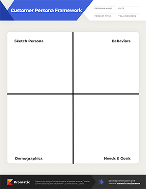
Describing their creation as “music blind tasting,” the duo set out to discover the two personas key to their plan: the artist and the consumer. They sketched out these personas on a sheet of paper (paper prototyping), knowing that understanding the relationship between the artist “Alex” and the listener “Mario” was crucial to a viable product. 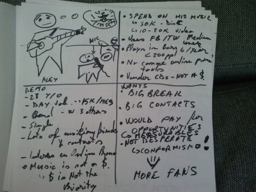 Artist Persona: Alex - single, 28 years old, holds a day job, makes $15k(MXN)/month - collaborates with three bandmates, has lots of musician friends and contacts - spends $40-50k/year making his music, plays 6 gigs/year for audience of 200, has no online promo tools - wants industry contacts and a big break, willing to pay for exposure
 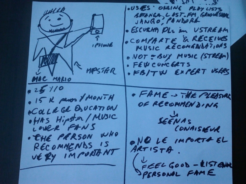 Customer Persona: Mario - hipster, 25 years old, college educated, makes $15k/month - uses online playlists, influenced by music recommenders, doesn’t buy much music or attend concerts, active on social media - music connoisseur, enjoys recommending, doesn’t care if the artist is famous
Step 2: Storyboard
Storyboard is the step 2 of paper prototyping. Now that they had the personas laid out, they had to zero in on that relationship. Understanding how a listener finds new tunes can make or break a music delivery service, so they interviewed musicians and fans to get a handle on what might make someone use their website. The team drew up a series of storyboards visualizing a seven-step process that would bring Mario into their website, where he could become a member and discover new music.
- Mario’s friend Juan likes a song on social media. Mario likes music, trusts Juan’s taste, and is intrigued by the song’s artwork/description, so he clicks on the link, taking him to the app to hear a 3-minute sample of the song.
- Mario is intrigued by the app’s layout, which includes Play and Discover buttons, and promises “your next favorite song” in three minutes.
- After hearing the first song, Mario begins listening to 15-second samples from the Discover feature, clicking Like on the ones he finds interesting, and having fun engaging with the platform. When each sample ends, he decides whether or not he likes it enough to add it to his playlist.
- Mario enjoys the One More Minute button, and keeps clicking on it, hearing new samples, until he gets bored.
- Mario is redirected to a Facebook login button, which he uses because he’s curious about the app and has already invested time listening to a batch of song samples.
- After logging in, Mario can see the details of the first song he liked. He can play the whole song, and either keep it on his playlist or delete it. The app includes Next and Previous buttons so he can listen again or skip ahead.
- Mario can see his list of favorites, and has the option of buying the songs/albums and learning more about the artists, or he can “roll again” to hear more samples.
Step 3: Wireframes
With a loose idea of how their users would be guided to their site, they set out to translate this process into wireframes. They knew they needed to beware of a bulky, obtrusive experience, so they focused on keeping the UI simple, clear, and elegant to create a site that flows seamlessly from one step to the next.
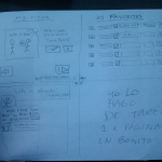
Initially songs were set to play for one minute, and the first version of the product was called “Bandemia,” the name of a music compilation project Yiyo had produced that they planned to use for their initial content. (They would later rename the project “TenTune,” a play on their eventual decision to limit the song samples to ten seconds.)
Step 4: Test Early
Despite having the technical abilities to do paper prototyping, that could have potentially taken months. Instead, Vlad look a lean approach and decided not to code right away. Vlad and Yiyo realized that what they needed most was to make their experience as engaging as possible to the end users. They needed as much data from listeners as possible. If users wouldn’t come and listen to several songs in a row, then Bandemia would need a massive amount of users to get enough data to tell which songs were more popular than others. For a website like this, acquiring users can be very expensive. Bandemia needed to go viral. Paper prototyping- So instead of building a product, they do a paper prototyping to simulate an experience that was close enough to their vision, hoping to get some real data on how useful and engaging the experience was. 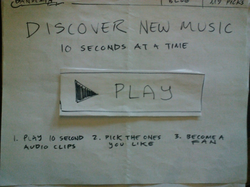 They showed ten people this hand-drawn mockup of the site, and asked them to essentially treat it like an analog iPod. If they wanted to play the music, they’d press the play button. Vlad then gave them a set of headphones that he plugged into his MP3 player, and played them ten seconds of music to simulate the experience customers would have on the site. The test subjects would pick the songs they liked and list them to save for later.
 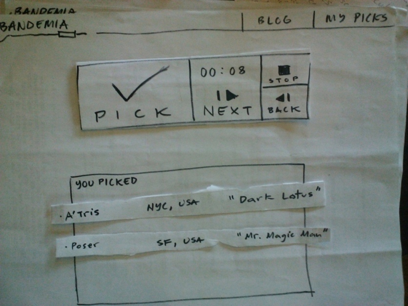 Paramount to the experiment was the intuitive nature of the product, and their primary goal was achieved: the listeners weren’t confused by the process. It didn’t seem to matter to the listeners that the prototype was written in English and being tested in a Spanish-speaking country (paper prototyping was done in English so Vlad would not have to later revise his coding for internationalization of the app). It was clear to the customer that they just needed to push the play button. The product made sense to the listener, which to Vlad and Yiyo, was a validation of their vision.
Step 5: A Working Product
With the successful coffeeshop test, Vlad went into developer mode, quickly coding a working (but still minimal) website. 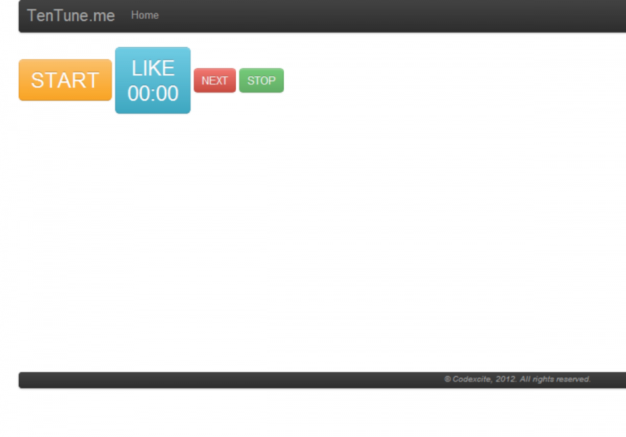 They pressed on, slowly iterating and increasing fidelity as they published the app and honed in on their market with live usability testing and promotion through Twitter and Facebook. They tracked everything, from feedback on social media, to how long it took someone to click next, to how many songs they listened to before leaving.
 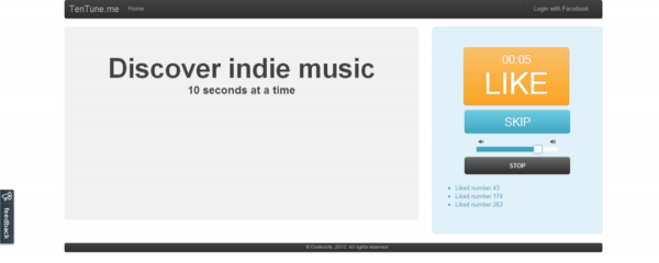 At the beginning they didn’t see a lot of likes, so they made the Like button more prominent by having it replace the Play button after it was pushed.
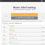
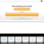
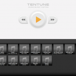
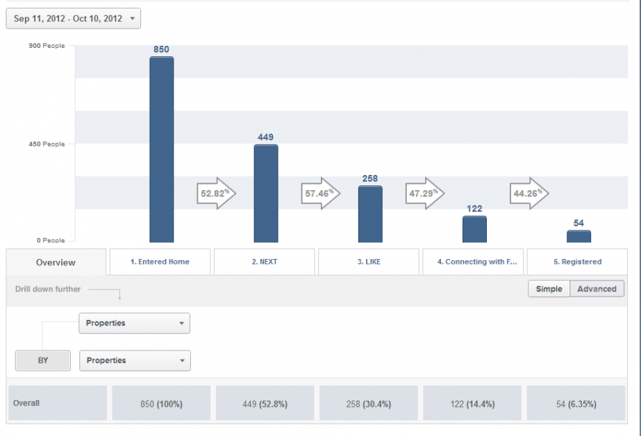
 In the first month, they saw people listened to an average of ten clips before leaving the site, 25% of users were liking a song, 22% went to the Facebook Connect page, and of those, 41% actually registered.
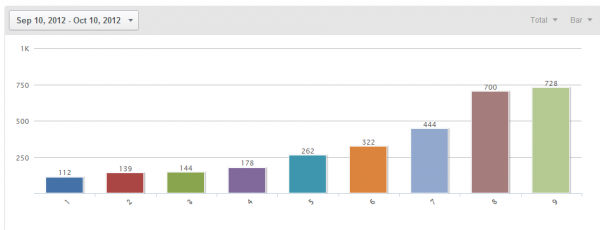
  Along the way, they learned a number of useful tidbits about paper prototyping that allowed them to modify the experience based on the data — the most significant being the amount of time a user needed to hear a song. Early iterations ranged from 1-3 minutes, but the coffee-house MVP demonstrated that listeners only needed ten seconds, which was validated by the metrics after the project was scaled up and coded. Out of 3,029 people, 47.24% skipped a song after only listening for 1-2 seconds - they knew right away that they didn’t like it. The paper prototype found the same key insight in a day that would have taken a month of quantitative data, revealing something many modern entrepreneurs wouldn’t suspect:
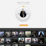
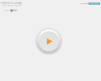
  The team spent weeks between each version (their biggest design challenge was to give everything a round shape in CSS), working in small increments from iteration to iteration. Eventually they settled on a production-ready version, with the front page just a single, orange Play button, based on what they considered the most positive experience from the paper prototype.
Step 6: The Other Side of the Market
The hard part, of course, was monetization. The music they were working with was from Yiyo’s Bandemia compilation albums, and they added some international bands to expand the sample list. But at some point they would need to charge bands to be listed, creating a two-sided market where bands were paying for exposure to listeners, plus data on those listeners. Of course indie bands are not the richest people in the world, and neither Vlad nor Yiyo were sales-oriented, so it was difficult to enlist bands to use the platform if they had to pay for the service. Having great user engagement is one thing, but that’s not enough for a business model. Tentune.me needed to engage the paying side of the market. 
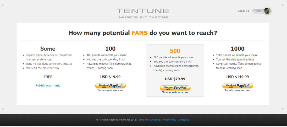 TenTune ultimately suffered the most common fate of startups — failure to gather enough paying customers to make the product viable. Despite positive user-engagement feedback, Vlad and Yiyo’s lack of a business model left them long on product and short on customers. TenTune applied the same rapid testing to the other side of the market that was critical for their business - the paying customers - the musicians. While listeners may love the service and find it addictive, TenTune’s model was that the musicians would pay for this exposure. Unfortunately, most small-venue musicians are broke, and don’t have the luxury of spending money on anything that doesn’t have the name Fender or Marshall on it. By rapidly testing musician demand with a landing page, they quickly found that the musicians couldn’t support the business model. Even though they had personal relationships with most of these early-testers, indie artists didn’t sign up for a paid plan. If anything, the personal relationship should have biased the test towards a false positive, with indie artists signing up out of feelings of personal obligation. But they just didn’t care enough to spend what little money they had, a clear signal that the value proposition wasn’t compelling enough. “One of our errors was probably focusing mostly on the end users and assuming we had the artists’ side covered and understood,” Vlad later told me. “When the come join pitch turned into come pay, it became obvious they wouldn’t. Most were performing as a hobby and were already on very tight budgets. What they wanted were gigs, and it wasn’t clear if TenTune would help them get those.” In retrospect, maybe that was the side of the market they should have started with. Looking back at Alex’s proto persona, perhaps TenTune’s riskiest assumption was that Alex was willing to pay for exposure — maybe they could have saved some time by starting with the musicians. With the speed and intentionally low fidelity of their testing, they invalidated their business model for a fraction of what a waterfall or “build it and they will come” approach would cost. Ultimately, the decision they made was not to pivot to another business model (e.g. trying to make record companies or band promoters pay for the data) but to stop work and move on to the next idea. Despite TenTune’s ultimate demise, the project garnered Vlad a host of new skills to launch a new venture in real estate (and, we assume, many future ventures down the road). And while Vlad gained a deeper understanding of lean startup culture, the rest of us benefited from an unusually robust (and robustly documented) sample of how far an entrepreneur can go with a pencil, a piece of paper, and a good idea.
Download Customer Persona Framework
Lessons Learned:
- You don’t need to build a website to test your idea. Low-tech = high-value.
- You don’t just build one MVP — each MVP is a new test and chance to learn.
- Even a great experience requires a business model.
- Test the riskiest side of the business model first.
Frequently Asked Questions
What is paper prototyping and why is it useful for startups?
Paper prototyping is the practice of sketching out product interfaces, user flows, and concepts with pencil and paper before writing any code. As product managers, we find it invaluable because it allows rapid iteration and testing at virtually zero cost. In TenTune’s case, a hand-drawn mockup tested on ten people in a coffee shop revealed the same key insight — that listeners only need ten seconds to judge a song — that would have taken a month of quantitative data to uncover with a coded product.
How did TenTune test their idea without building an app?
Vlad and Yiyo showed ten people a hand-drawn mockup of their music app and asked them to interact with it like an analog iPod. When a tester pressed the “play” button, Vlad played ten-second music clips through headphones connected to an MP3 player. This paper prototype validated that the experience was intuitive and that listeners could quickly decide whether they liked a song — all without writing a single line of code.
What was TenTune’s biggest mistake?
TenTune’s biggest mistake was focusing primarily on the listener experience while assuming they had the musician (paying customer) side figured out. When they finally tested whether indie artists would pay for exposure, they discovered most musicians were hobbyists on tight budgets who wouldn’t spend money unless it directly led to gigs. As Vlad reflected, they should have started by testing their riskiest assumption — that artists would pay — before investing heavily in the consumer side.
Why did TenTune fail despite having good user engagement?
TenTune had strong listener metrics — users listened to an average of ten clips per session, 25% liked songs, and 41% of those who reached the Facebook Connect page actually registered. However, the business model depended on musicians paying for exposure, and indie artists simply couldn’t or wouldn’t pay. Great user engagement alone isn’t enough; we need a viable business model where the paying customer actually sees enough value to open their wallet.
What are the key lessons from the TenTune paper prototyping case study?
The TenTune case teaches us four critical lessons: you don’t need to build a website to test your idea — low-tech prototyping delivers high-value insights. Each MVP is a new test and chance to learn, not a final product. Even a great user experience requires a working business model. And most importantly, we should test the riskiest side of the business model first, which for TenTune was whether musicians would actually pay.

Comments
Loading comments…
Leave a comment