Monte Carlo Simulation for Innovation: A Practical Forecasting Guide
Turn deep uncertainty into a probability you can actually act on
Quick Answer: A Monte Carlo simulation replaces single-point estimates in your business model with ranges for each variable, then runs thousands of simulated trials to show the probability of reaching your goals. As product managers, we can use this to turn deep uncertainty into actionable forecasts — whether for financial returns or mission impact — by mapping cause and effect, estimating variables as ranges, choosing appropriate distributions, and using tools like tornado charts to prioritize which assumptions to test first through experiments.
By Tristan Kromer Every project has uncertainty. It’s just a question of how much. Some projects are simple and the uncertainty is quantified and known. The decision to bet on red at the roulette wheel has a clear level of uncertainty and a known payoff (unless you suspect foul play)! So we can make easy decisions as to whether or not to invest our time and money for the expected payout. (Hint: Playing roulette is never a good idea unless you take great joy in making bad bets.)  The more complex and uncertain each part of a project, the more challenging these decisions are. No one would suggest placing a bet in Vegas without knowing the payout of a bet, the cost of buying in, or the game we are playing. But in innovation, we do this all the time. How can that be right? When creating a new business model, or just implementing a new product feature designed to improve our existing business, we have some expectations. We want to achieve a goal. That goal could be financial, or it could be another form of impact such as CO2 reduction, improved diversity, or loss prevention. But in all cases, we want to achieve something by investing resources. Even if all we need to achieve is gather some information about the opportunity space. That means that even if your outcome is not in dollars and cents, we will have a Return on Investment (ROI) calculation. We might have a goal to:
- Achieve >15% financial growth
- Lift one child out of poverty for <$5 USD
- Protect one hundred acres of land with <1 person year of labor
- Identify the market size
We want to know if we will achieve those outcomes before we invest the resources – or at the very least, our odds of success. Creating financial or mission impact forecasts is a critical skill that allows us to make clear-headed pivot, persevere, or kill decisions. But how do you create a model if you don’t know what numbers to put in for your hypotheses? If you do this wrong, you’ll fall into some common mathematical errors. That is where a Monte Carlo simulation comes in.
Why We Use Monte Carlo Simulations in Innovation
To start, let’s take a basic model as an example. Profit = (average purchase price per unit - cost per unit) * number of customers. So if we sell fancy collectible sporks for $20 each and they cost $10 to manufacture, we’ll have a $10 profit per spork. If we sell 100,000 sporks per month, we’ll earn $1M per month and $12M per year. (The spork business is booming!) But we sell these sporks in an auction process to maximize profit. So we don’t actually know the purchase price of each collectible spork, and we can’t predict the average price until we collect some data. It could be $25 on average or it could be as low as $10. Similarly, the price to produce those sporks could be as low as $2 per spork or as high as $17 due to fluctuating labor costs and materials. If the price to produce a spork is $17 and the average purchase price is $10, we’re in big trouble. We’ll be paying people to take our sporks! This is exactly the type of situation where a Monte Carlo simulation can be very useful. Instead of accepting a single number for each variable (price, cost, and # of customers), we can accept ranges for each variable instead. If we can do this effectively, we can calculate the odds of having a profitable business or significant impact. For innovation projects, you simply must know how to use a Monte Carlo simulation effectively. Also, you should know when not to use it.
What Is a Monte Carlo Simulation?
A Monte Carlo simulation is a way of figuring out the most likely outcome of something that is very complex and uncertain by simulating it a large number of times. For example, we could simulate the outcome of a coin toss by creating a computer simulation of a coin and running it 100,000 times to determine that the odds of landing on heads are approximately 50%. Of course, this is a simple situation and there is no need to use a simulation. Everyone knows the odds of heads in a coin toss are 1/2 = 50%. But to calculate whether a storm will grow into a hurricane is a very complex situation involving a large number of variables including water temperature, air temperature, humidity, location, prevailing wind conditions, etc. To compound the issue, we don’t know all of these variables in every location that might influence the storm. We only have a few data points from some locations, and there is a margin of error on those data points as well. The weather is far too complex to simply calculate by hand, and all the variables are highly uncertain. Instead, a computer simulation is used. This computer simulation takes the data we have and tries out different combinations. For example:
- Trial 1: Temperature 72 degrees, wind speed 6 mph NW
- Trial 2: Temperature 70 degrees, wind speed 7 mph W
- Trial 3: Temperature 71 degrees, wind speed 5 mph N
- Etc
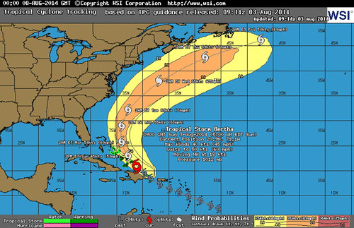 The computer can do this several thousand times with several thousand variables if needed. That’s what creates those easy-to-understand predictions such as 70% chance of rain. This simple prediction allows us to make important decisions such as whether to bring an umbrella or not. A Monte Carlo simulation turns something very complex (such as human purchasing behavior) into a forecast of possible outcomes we can understand – and it works for any project! Financial outcomes or mission impact? Radical innovation or core business line? No problem.
How to Create a Monte Carlo Simulation
The basic steps are:
- Use Storyboarding to map cause and effect
- Identify observable metrics
- Create a mathematical model
- Estimate variables using ranges
- Choose the data distributions
- Setting up the simulation
- Run the simulations
- Interpret the output
- Collect data and iterate
Let’s go into detail for each part.
Use Storyboarding to Map Cause and Effect
We did this already in our simple spork example above. Profit = (average purchase price per unit - cost per unit) * number of customers. A model should be an explanation of cause and effect. The inputs are average purchase price, cost per unit, and number of customers. These inputs cause the output variable of profit. If we raise the prices, profit will increase. If we raise the costs, profit will decrease. In this case, the output is profit, but it could be anything from the projected location of a hurricane to the number of octopuses that will survive from egg to adulthood. Generally, we recommend working with a qualitative view of the user behavior such as a user journey map or storyboard. This can be used to identify variables that truly cause the output (not simple correlations that might be mistaken for causation.)  A user journey map or storyboard represents a hypothesis of cause and effect. We believe that when the user identifies that they need a new part for a washing machine, then they will google that part to compare prices on different sites. This is not always the case, of course – some customers may decide it’s not worth fixing the machines themselves. Others may not be price-sensitive and will purchase the first replacement part they can find. But it’s a good hypothesis for cause and effect because we know that if they do not identify a broken washing machine part that they need, then they definitely will not be searching for a replacement. Even early stage projects at Day Zero can make use of qualitative observations of existing behavior (sometimes known as contextual inquiry) to help understand this cause and effect. Additional hypotheses about the design of your product or service will help improve this model of how we hope and how we predict users will behave when we actually launch a Minimum Viable Product (MVP). When we have a real product with real users, more quantitative experiments such as advanced analytics, data mining, and A/B testing can be used to further refine our understanding of cause and effect.
Identify Observable Metrics
Based on the cause and effect, we can then select metrics. This is relatively simple given a well-thought-out storyboard. We can easily identify the observable behaviors that happen in each frame of the story. For example, seeing a value proposition on a landing page is one frame and signing up happens in the very next frame. 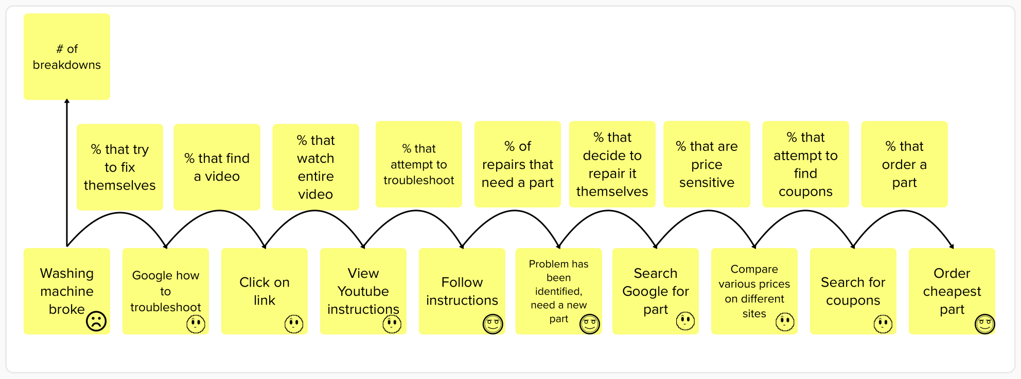 Creating actionable metrics is then usually just a question of dividing the metric representing the effect by the metric representing the cause. For example:
- # of signups / # of landing page views
- # of purchases / # of visitors
- # of tons of CO2 remove / # of trees planted
We need to take care to make sure that the actual data will be easy to collect and as accurate as possible, but as long as we can measure our starting number (number of visitors), we should be able to calculate the output. With these metrics chosen, we have a complete hypothesis of how our business actually works.
Create a Mathematical Model
Once we have our cause and effect model along with the selected metrics, we can actually construct a spreadsheet. My apologies to the spreadsheet-averse – we will have to create an actual spreadsheet here, but they are usually simpler than most people expect. In workshops, even the most mathematically challenged attendees get through it unscathed. The formulas can get lengthy, but most models require only addition, subtraction, multiplication, and division. Nothing scary. On the example spreadsheet available for download here, you can see a number of industry examples, including models with market size, two sided marketplaces, non-profit examples, and more. Notice that all of these models are driven by hypotheses. We never estimate the critical output value in a given time period directly. In other words, we would never try to guess how much money we’ll make in 2025. Rather, we only estimate the components or input variables we identified in our cause and effect model. Everything else is calculated using those smaller components in a formula. 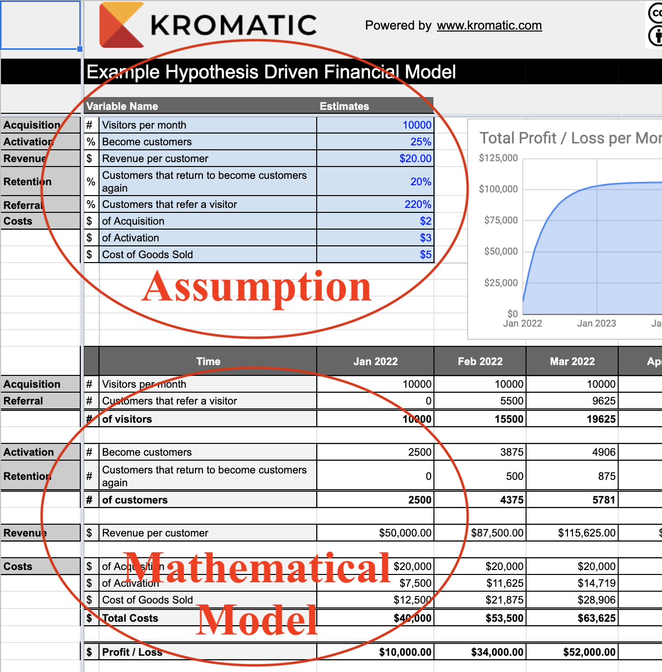 That means when we add in actual values as either estimates or from quantitative experiments, our entire forecast will update automatically. But this spreadsheet is just a start, because we don’t know the exact numbers that can go into the model.
Estimate Variables Using Ranges
Once we have our model and have identified our metrics, we need the actual numbers that go with them. But instead of guessing a precise number such as 2,000 visitors per month, we will use ranges such as 1,000 to 5,000 visitors per month. This range represents our level of uncertainty, and for early stage projects, the ranges may be pure guesses at first. In our example:
- Cost per unit = $2 to $17
- Average purchase price per unit = $25 to $10
- Average number of units sold = 150,000 to zero (Maybe no one will buy our sporks at all!)
The wider the range, the higher our level of uncertainty. If the possible number of customers is 1,000 - 5,000, this is considerably more certain than saying our possible number of customers is 10 - 20,000. (Note for statisticians: I am assuming the intervals here represent 90% of the possible values and are gathered through quantitative experiments or by using a combination of estimation methods such as an equivalence bet. However, there are a variety of methods to use ranges including using a range to represent 99.6% of the possible values a.k.a 6 standard deviations in a normal distribution.)
Choose Data Distributions
It is not enough to simply know the range. In order to run the simulation we need to know the likelihood of any given value within that range. Is it more likely that the average purchase price is $25? Or $10? Or $19? Or $12? We can describe the likelihood of landing somewhere within that range using something called a distribution. This can get very complicated very quickly. So we’ll only explain three distributions here.
Normal Distribution
A normal distribution (sometimes called a Gaussian distribution) is that bell curve you learned about once in math class a long time ago and it looks like this: 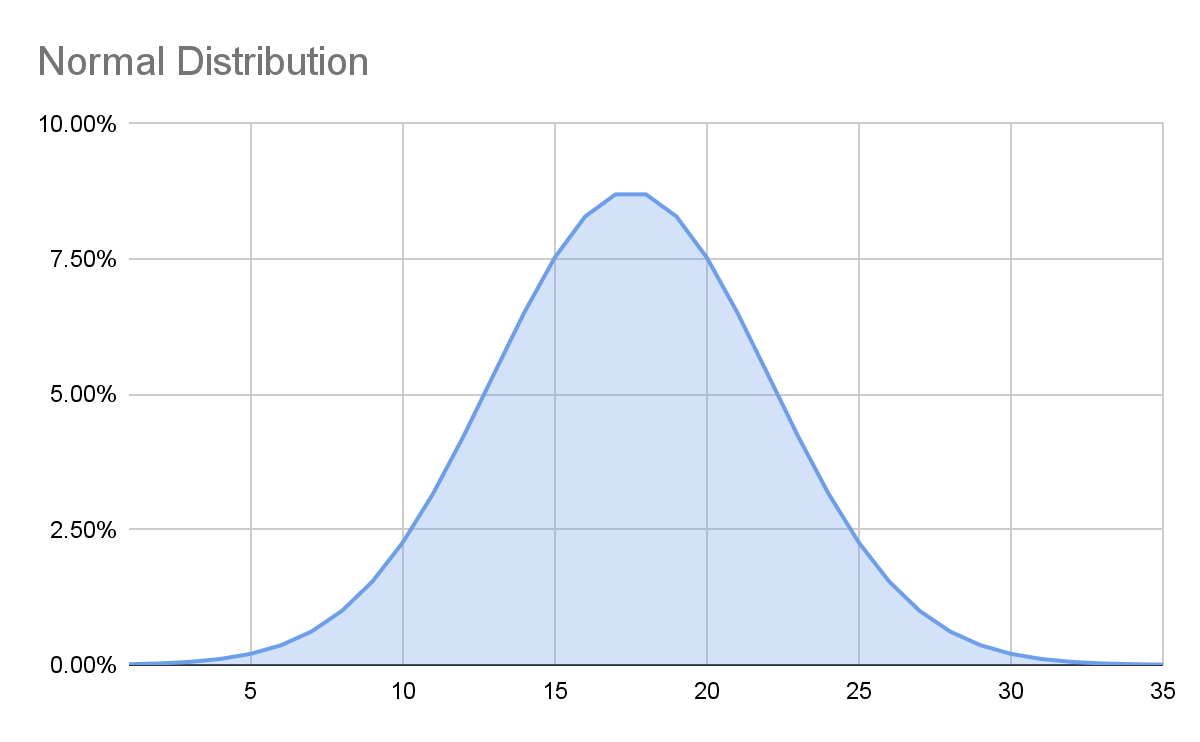 If we use this for our average purchase price, we are saying that while it’s possible that an individual spork’s price could be as high as $25 and as low as $10, we expect the average to be a lot closer to the middle of $17.50. In other words, it is more likely that the true number is in the middle of our range than the edges. Assuming a value is normally distributed within a range is an assumption and could be wrong! But it’s a decent place to start – we must make some assumptions. (Note for statisticians: The Central Limit Theorem gives some justification for this assumption.)
Exponential Distribution
An exponential distribution is one where it is far more likely to have a result near the low end of your estimate than the high end. For example, most earthquakes are very small, but occasionally there is a very big one. 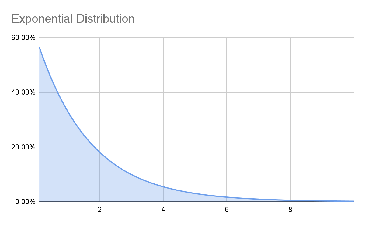 If our estimated range of earthquake intensity was 0-4 on the Richter scale, the most common result with an exponential distribution would be closer to zero than 2, the exact middle of the range with a normal distribution. Again, we need to make an assumption about which distributions to use in our model, and we could be wrong! For our spork model, an exponential distribution doesn’t really fit, so we won’t use it.
Gamma Distribution
A gamma distribution is commonly used when we have a range that is close to zero, but a value that should never be below zero. It can look like this: 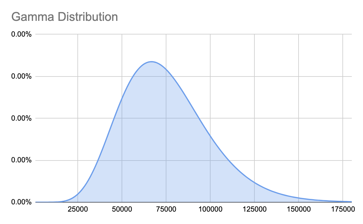 The Gamma distribution looks identical to a Normal distribution for higher values, but as the range gets closer to zero, the curve begins to look more and more lopsided. That’s what ensures it never goes below zero. For example, we estimated the average number of units sold per month as anywhere from zero to 150,000. If we created our range to represent 90% of the possible outcomes (this is a standard approach in creating estimations) and we use a normal distribution, our Monte Carlo simulations will occasionally show us selling less than zero sporks, which is impossible. We aren’t going to permit people to sell us sporks. So using a Gamma distribution will prevent our computer simulation from producing nonsensical possibilities when negative numbers don’t make logical sense. In other words, the Gamma distribution is a better distribution when a negative number doesn’t make logical sense.
Other Distributions
There are a number of other distributions that are very useful for financial or mission impact models, and you can download our spreadsheet of distribution examples to learn more. They include:
If you find yourself in need of a more esoteric distribution, it’s a good time to call in the friendliest data scientist you know! The most common ones our team encounters in business models has been Beta, Binomial, Discrete, Gamma, and Normal.
Setting Up the Simulation
Now that we have created all our hypotheses, including the cause and effect model, the ranges for each variable, and the distributions that apply to those ranges, we can finally create the Monte Carlo simulation. We already have a mathematical model in a spreadsheet, but there’s no way to put a range of numbers into each variable. So we can use a number of different tools to make this possible. In Excel, our favorite plugin at Kromatic is SIP Math. But in our Innovation Accounting training, we just use our own template which doesn’t require any plugin. This is because SIP Math lacks some functionality, like being able to easily create a Hurricane graph showing progress over time. Sadly, there is no useful plugin to do these simulations in Google Sheets. It’s necessary to hand code the random numbers. The plugins that do exist for Google Sheets are extremely slow and unable to run more than 100 trials without freezing most browsers. However, we did start working on a more advanced approach. If it’s something you are interested in, please comment below and we’ll see if there is enough interest to justify building it. There are a growing number of Software-as-a-Service (SaaS) tools that also allow for running Monte Carlo simulations, but thus far we are unable to recommend any of them over creating a spreadsheet.
Run the Simulations
Now it’s just a question of pressing ‘Go’ (or in Excel, “Calculate Now.”) Essentially, this is now rolling a bunch of dice and getting some random numbers to run through the model. Run the simulation 1000 times for a quick look, but run it 10K-30K times if you’re ready to make decisions. Depending on the complexity of your model and the speed of your computer, this can take a while. (Don’t try 10K trials with Google Sheets – it will take longer than waiting for the next Game of Thrones book to come out.) The reason you want to run the simulation so many times is just for accuracy. If you flip a coin ten times to figure out the odds of getting heads, it may surprise you to see that the odds are 70%. Is the coin rigged? Well, maybe. But more likely you probably just didn’t flip it enough times to account for a large Margin of Error. If you keep flipping you’ll see a phenomenon called the Reversion to the Mean, and the observed probability of getting heads will approach 50%. Running a simulation a large number of times will also help you see any unlikely (but extremely impactful) outcomes that are sometimes called black swans.
Interpret the Output
Now we should have some answers! There are a number of ways to represent the output of a Monte Carlo simulation. We’ll cover the most common outputs here. Histogram The most common output shows the range of possible outcomes on the X-axis and the probability of that outcome on the Y-axis. This creates something that will probably look similar, but not identical to a bell curve. However, the output can be almost any shape depending on the model. 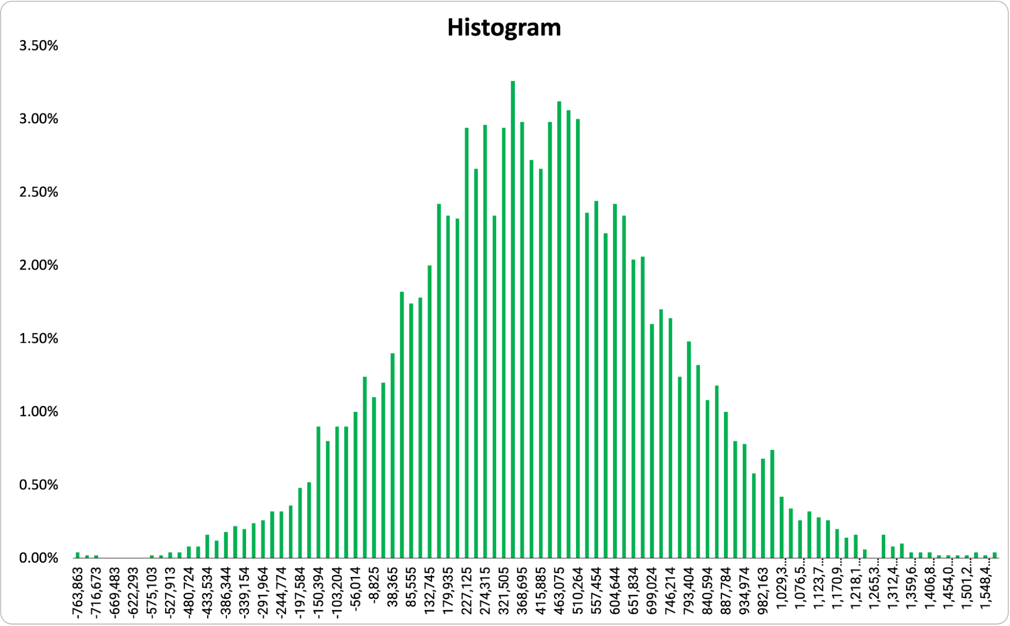 Essentially, the taller the bar, the more likely that outcome. This allows us to take a quick look at what the range of possible outcomes are and the most likely outcome. For some templates (like ours), if you set a goal, the graph will color code to show you outcomes that are above the goal (here in green) and those that are below (here in red).
  One important note, a histogram only shows you the possible outcomes at one point in time.
Hurricane Graph
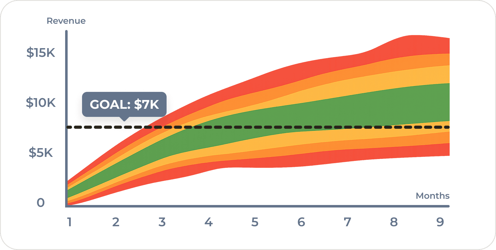
A hurricane graph is a way of representing the outcomes over time. Essentially, it is all the histograms of every period of time added together and it looks like this: 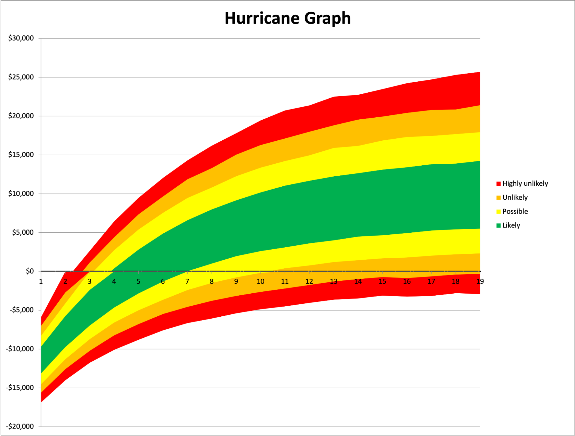 The X-axis represents time, the Y-axis represents the value at that point in time, and the color represents the likelihood of the outcome within that range. A histogram is like a single slice of this chart, but spread out horizontally for easier viewing.
Probability
My favorite, and the easiest output to understand, is simply a probability of reaching a given goal. For example, we might want to know the likelihood of bankruptcy within 4 years, the chance of reaching 20 million tons of CO2 removed from the atmosphere, or today’s chance of rain. In this case, we don’t get a lot of details such as how much it will rain – but if we’re just trying to decide whether to take an umbrella we don’t really care. Getting moderately wet is just as bad as getting soaked. So we just want to know if it will rain at all. A simple probability can be a great way to understand the output and make a quick decision. 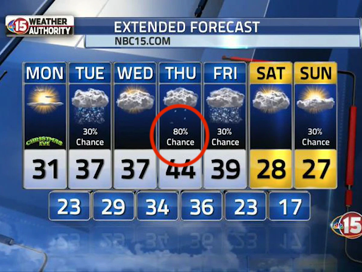 You’ll notice the output of a standard weather forecast includes both ranges for possible temperature variation throughout the day, but also these specific probabilities of rain.
Tornado Chart
Lastly, some templates will create a Tornado chart to show which variables have the most impact on the outcomes. Below is an example using a simple One-at-a-Time (OAT) Sensitivity Analysis to create the chart. The variable listed on the top of the tornado has the biggest impact on the outcome. (Sometimes this same analysis can be done without the chart, and the template will just list the most impactful variable.) 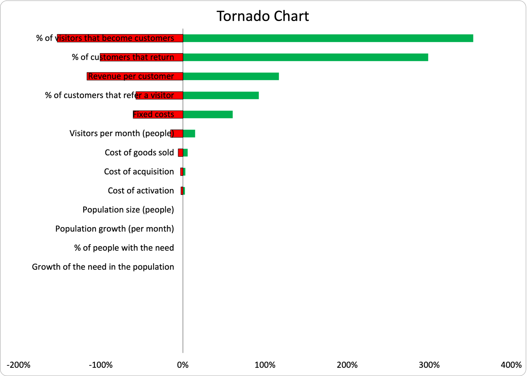 This data tells us exactly where we should focus our experimentation. This is a fantastic prioritization method because we now know exactly what the project team should do next in order to decrease the uncertainty in the outcome. If the analysis shows “Retention” as the most impactful variable, the team should begin running retention experiments as soon as possible. If it’s “Activation,” shift gears and focus there. As we get more information and reduce the range of the most impactful variable, we shouldn’t be surprised to see the most impactful variable change. We’ve gotten more information, so the source of uncertainty has changed and we can reprioritize our efforts. Please note, an OAT sensitivity analysis can only be used for basic models not using unusual distributions. There are more sophisticated types of sensitivity analysis for more complex models.
Collect Data and Iterate
Of course, all models are approximations of reality. It’s critical to see if your assumptions are actually correct. All of the metrics were chosen based on observable user experience in the storyboard (or user journey map), so they are all testable. We don’t need to wait until 2026 to see if our prediction is correct. We can test the variables directly. As we run tests, we can input the actual data to overwrite our estimates. We can decrease the ranges of variables as we get more information. If it turns out that reality disagrees with our model, then our model is wrong. Always trust reality over your assumptions. Now our job is to figure out why the model is wrong. Were our ranged estimates too narrow? Did we choose the wrong distributions? Or did we simply not understand the cause and effect correctly? Run experiments on independent variables and iterate!
Common Objections
Of course, with any approach to innovation, there are bound to be skeptics. That’s good!
Objection: Innovation Is Inherently Unpredictable
No. The problem with this objection is that uncertainty is not binary. Things are not known or unknown, they are more or less known. I am quite certain that the sun will rise tomorrow, even if it is concealed by clouds. I am tempted to say it’s 100% certain, but who knows? The dragon at the end of the world could have swallowed it. But I feel pretty confident.  On the other hand, I have very little idea of what I’ll have for dinner tomorrow – but there is a range of possible outcomes that does not include shrimp. (I would rather die than suffer their rubbery texture in my mouth). There are all sorts of other things that are semi-predictable. I expect I will wake up between 5:30 and 7am tomorrow. I will probably spend between $12 and $15 for lunch. The number of children I have will likely not change within the next year, but it might in the next 5 years. If innovation were completely random and chaotic (without a normal distribution in sight) then no one should ever become an entrepreneur. We invest in ideas because we believe there is some chance of success. We know that our idea is not likely to be a trillion dollar idea, we hope it’s a billion dollar idea, and more likely, it’s somewhere between a few million and zero. Uncertainty is not binary. A Monte Carlo approach explicitly allows for these varying degrees of uncertainty.
The Model Could Be Wrong
Yes, of course it could. The model is a set of assumptions used to generate an output from inputs. It could be completely wrong. However, the model is the same set of assumptions we would use in a standard financial or mission impact model. Businesses do work by cause and effect in a predictable fashion. While user behavior is uncertain and assumptions around that behavior can be flawed, the alternative is to simply go on faith – and faith is simply a different set of assumptions. In other words, the alternative to not making assumptions about your business model is to make assumptions about the outcome. Anyone who seriously makes this objection should instead direct their energy into validating the assumptions behind a model (a.k.a. Collect Data and Iterate) instead of complaining that there are inevitably assumptions. (By the way, you could simply have a typo in your spreadsheet so get a second set of eyes on your work before you assume it’s all been in vain!)
The Estimations Could Be Wrong
Yes again. Our estimations could be wildly inaccurate. Again, the answer is to validate our assumptions as quickly as possible and incrementally improve the data we are using in our model. There are various methods of estimation that can be reasonably used to improve estimations. Most importantly, since we are allowing ranges into our simulation, we are representing the level of uncertainty with the width of the range. That is exactly what we want out of this simulation in the first place – a realistic but imperfect representation of the possible range of outcomes. As long as we accurately represent the uncertainty in our ranges, we are improving on a basic business case or mission impact model that claims precision but lacks accuracy.
The Math Is Hard to Understand
Yes, true. It is quite honestly hard to understand some of the formulas behind different distributions. However, the principles are not as complex as they seem and can be learned by anyone with the will to do so and a bit of elbow grease. As I mentioned above, even the most spreadsheet-averse individual usually finds that they are able to get a working model in a couple of hours. The entire process is much less intimidating after doing it once. You may decide that a Monte Carlo simulation is not worth the effort and to outsource the spreadsheet work – but doing it once will allow you to see the principles in action and be better able to communicate with the math nerds (like me) on your team.
When Not to Use a Monte Carlo Simulation
With any approach, there are some caveats. Monte Carlo simulations are a good practice, and with some experience, they can be done fairly quickly. I can usually model something basic in 30-60 minutes. (Again, a range of uncertainty.) But some scenarios can be very complex to create and others can provide no additional value. So here are a few situations where a Monte Carlo simulation would be a waste of time.
Only Normal Distributions
I’ve seen a large number of business cases that only use Normal distributions and can save time by taking a shortcut. These are often cost-cutting projects where an existing process is being optimized to save time or money, and they do not require a Monte Carlo simulation. Instead, the same results can be produced by taking the median of each number and inputting it into a basic financial or mission impact model. This produces the most likely result in a Monte Carlo simulation. Similarly, to find the lower 25% bound of possible outcomes, take the lower 25% of possible inputs and run it through the model. But beware! A more complex model can use only normal distributions to produce unexpected results. The better approach here is to use tools or templates you are comfortable with to run a Monte Carlo simulation on all models. If you are adept at the tools, this is just as easy as creating a basic model without a Monte Carlo simulation.
No Loops
A loop can be found in any model where there is some form of reinvestment from one time period to the next, like the compound interest in your savings account. 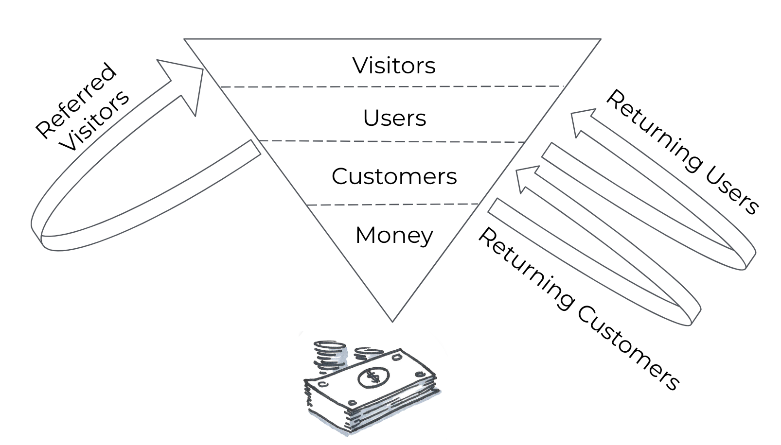 For example, if some % of your customers today return as customers tomorrow, this is a retention loop. If you reinvest some of your profit today in advertising tomorrow, that is also a loop. If your customers today invite new customers tomorrow, that is a referral loop. Loops are quite common in business cases, and they tend to lead to unpredictable outcomes that our human brains aren’t great at estimating. We are naturally good at evaluating simple linear equations. When something becomes exponential as the result of a loop, we are lost. If your model has no form of loop, then a Monte Carlo simulation probably won’t add much to your decision making. You could just add the best case and worst case scenarios together and divide by two. But given this is hardly ever that case, it’s not a recommended approach.
Lessons Learned
Whoa! Congrats on making it to the end of a very long article with a lot of detail. Let’s simplify the main points here.
- All projects should create a forecast of their outcomes and impact.
- All projects have some level of uncertainty.
- Monte Carlo simulations are a method of predicting outcomes and impact in situations of uncertainty.
- Creating Monte Carlo simulations isn’t easy, but it’s easier than you think:
- Use Storyboarding to map cause and effect
- Identify observable metrics
- Create a mathematical model
- Estimate variables using ranges
- Choose the data distributions
- Run the simulations
- Collect data and iterate
With a little time and practice you’ll be making better forecasts and better decisions. (And of course we’re happy to teach you in our Innovation Accounting program!) Special thanks to Elijah Eilert, Peter LePiane, Kenny Nguyen, & Megan Kennedy for reviewing a draft of this post and providing valuable comments and suggestions.
Frequently Asked Questions
What is a Monte Carlo simulation and how does it help with innovation forecasting?
A Monte Carlo simulation predicts the range of likely outcomes for a complex, uncertain situation by running thousands of simulated trials with different variable combinations. Instead of plugging single-point estimates into a business model, we use ranges for each variable (like cost, price, or number of customers), and the simulation calculates the probability of achieving our goals — whether financial returns or mission impact.
How do you set up a Monte Carlo simulation for a business model?
We start by mapping cause and effect using a storyboard or user journey map, then identify observable metrics and build a mathematical model in a spreadsheet. Next, we estimate each variable using ranges instead of single numbers, choose appropriate data distributions (such as Normal, Gamma, or Beta), and run the simulation thousands of times. The output shows the probability of reaching our goals and which variables matter most.
What’s the difference between a normal distribution and a gamma distribution in a Monte Carlo simulation?
A normal distribution (bell curve) assumes the most likely value falls in the middle of your range, with outcomes tapering equally on both sides. A gamma distribution is better when your variable can’t logically go below zero — like the number of units sold. As the range gets close to zero, the gamma distribution skews to prevent nonsensical negative values while behaving like a normal distribution at higher values.
When should you NOT use a Monte Carlo simulation?
We can skip a Monte Carlo simulation when our model uses only normal distributions and contains no loops (like reinvestment, retention, or referrals). In those simple cases, we can just use the median of each input for the most likely result. However, most real business models do contain loops that create exponential effects our brains can’t easily estimate, making Monte Carlo simulations well worth the effort.
How do you decide what to experiment on after running a Monte Carlo simulation?
A tornado chart or sensitivity analysis from the simulation reveals which variable has the biggest impact on outcomes. As product managers, we should focus experimentation on that variable first — if retention drives the most uncertainty, we run retention experiments; if it’s activation, we shift there. As we collect real data and narrow our ranges, the most impactful variable may change, and we reprioritize accordingly.

Comments
Loading comments…
Leave a comment